When me and my group had to look at competitors examples, we focused on B&Q and Wickes. Two very big companies that clearly know what they are doing as they have probably been going the longest. Looking at these two companies design choices would help our decisions on what to create for eDecks. We mainly put focus towards their websites and social media platforms, these are the biggest sources of information we could take inspiration from.
Websites
After taking a look at eDecks’ website landing page we realised something as a group. That these kind of companies have a lot of stock to include in their websites. We had already agreed that eDecks’ website included way too much information in the worst way possible, due to its lack of well thought out design choices. All of eDecks’ fonts were different they had a mass variety of colours and too many images cluttered together. After looking at eDecks’ front page we all imagined there was no hope for fixing it.
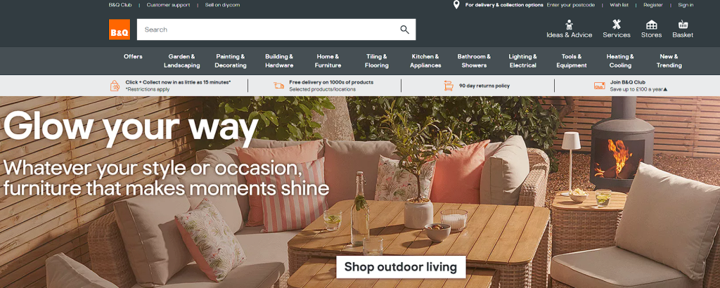
However B&Q have managed to prove us wrong. Even though there might be seen s too much information at the top, B&Q managed to keep their workspace tidy and easier to understand unlike eDecks. B&Q follow a strict colour pallet and font style to allow consistency throughout their other online media such as social media posts and advertisement.
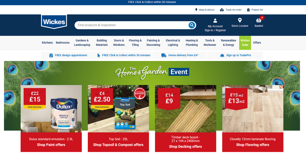
Wickes too managed to keep a fluent design within their landing page. However whilst further looking at this particular shot, I wasnt too keen with their choice of font for ‘Home & Garden’ included on the green banner behind the sales products. eDecks had information displayed like this and in my opinion it goes against their specific font style. It may also be harder to read for some of the users.
Social media
Moving onto the companies social media posts, B&Q again managed to create a post that suits everything about them. They follow their traditional orange and grey colour pallet and keep using the specific font family. Their choice in imagery is effective, promoting the companies best sellers during a 15% off deal. Great way to grab the audiences attention.
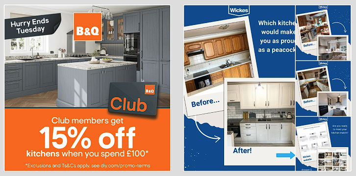
Compared to eDecks’ posts Wickes is better, but this post I found wasnt finished so well. What I assume is the main piece of information on this post has been slightly cut off on the right. This is not only harder for the audience to read and understand, but also might make them not want to read it at all.
REFRENCES
B&Q (2025) B&Q Available at: https://www.diy.com/ (Accessed on 2/5/2025)
Wickes (2025) Wickes Available at: https://www.wickes.co.uk/ (Accessed on 2/5/2025)
0 Comments