Early Design
The initial phase of early design was to create some visual mood boards for each individual brief I have been tasked to explore with. These mood boards help acted as a guide for the design process for my further journey of designs. To develop these mood boards I examined current and pre existing brands to pick out key features that will work best for my designs. Such as colour, font style, logo design etc.
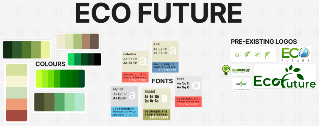
Colour plays a vital role within logo/ brand design, depending on the colours used within a logo can evoke specific emotions and meanings. Therefore it’s crucial I pick out hues that align with the brand’s values and target audience. For instance green can be associated with nature. That being the perfect colour for Eco Future.
Next I analysed a variety of font styles for each brief. As typography also plays a significant part in branding, fonts can communicate different personalities. For example a bold, sans-serif font can convey strength, whilst a serif font could suggest tradition.
Finally, examined the shapes and design elements in pre existing logos and brands. Shapes can have powerful connotations, for instance a circle represents wholeness, sharp angle shapes can convey energy. By understanding the design principles for a logo I can aim to create the perfect logo for my chosen brief.
Logos
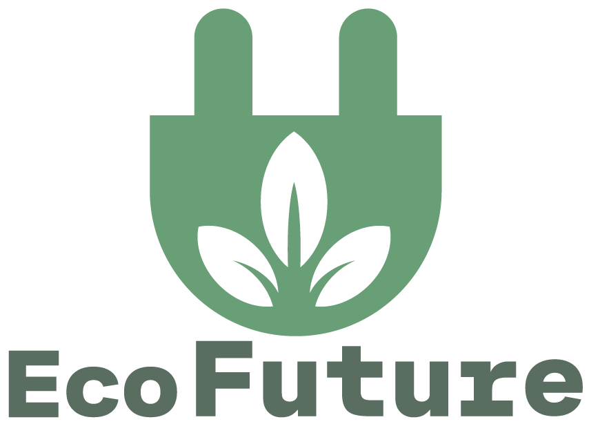
After deciding which brief I was going to continue my assignment on (Eco Future) my first step was logo design. I chose Eco Future, so initially I went back to that mood board to take a look at the pre existing designs I had collected. This gave me a clear understanding on depending with the shape depends on the placement of text. Along with looking at previous logos, I can also look back at the various colour palettes I sourced to choose which one I could work with the best. Since we had to make 3 logo mock-ups I wanted to be sure each one is completely different. Not only in the shape but also the colour, that will give me a clear understanding which one works best.
Logo One
The first logo I created was probably my favourite in shape. I chose a hexagon shape and transformed the points into curves. In my opinion this is my favourite as it gives of a real modernism look/ style. Further more why I gave it a gradient in colour. I believe the brand name “Eco Future” especially “Future” works best for this logo since it gives of the most modern aesthetic, hence everything becoming more modern in the future to come.
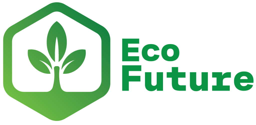
Since this brief is about eco friendly energy I had to incorporate some sort of plant like shape or even some sort of energy symbol with my hexagon shape. Resulting in the design I have now, I gave the inside of the shape a base and created a plant sprouting from the bottom. Overall, this is my favourite logo, I believe it also looks just as good without the text and due to its shape could work nearly anywhere. However, a logo without text tend to be extremely memorable, this logo perhaps isn’t. And could maybe be confused with others.
Logo Two
For my second logo I wanted to attempt to create a more energy like logo. The best way to accomplish this task was within the shape and perhaps the colours. Therefor I resulted with this plug like shape, and the same plant design from logo one in the middle of it to achieve it being eco friendly. Since I wanted these logo mock ups as different as possible I wanted to give them all different shades/ hues of greens. Perhaps afterwards I may like one logo but prefer it in the colour from another. With this particular logo I experimented with some pastel greens. In my opinion these are my favourites out of the other pallets and will probably be using them in my banner designs.
Logo Three
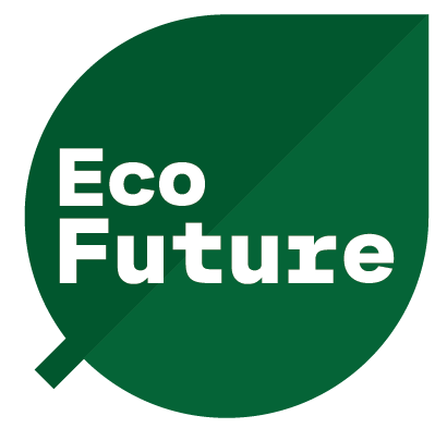
Finally my third logo, out of the three I have created this is my least favourite. It lacks creativity and all-in-all it doesn’t fit the brief. The only thing it works for is it being eco friendly because it’s the shape of a leaf. The chosen colours are alright but not for me and mostly won’t be used in the up coming designs.
Wireframe prototyping
Wireframing is a great purpose for website design, they allow the designer to have a clear understanding of placement and grid systems for each individual element. Website mock ups tend to be split off into three separate fidelities. Low, medium and high fidelity. Below is my sketched low fidelity and my mid fidelity I created using Figma.
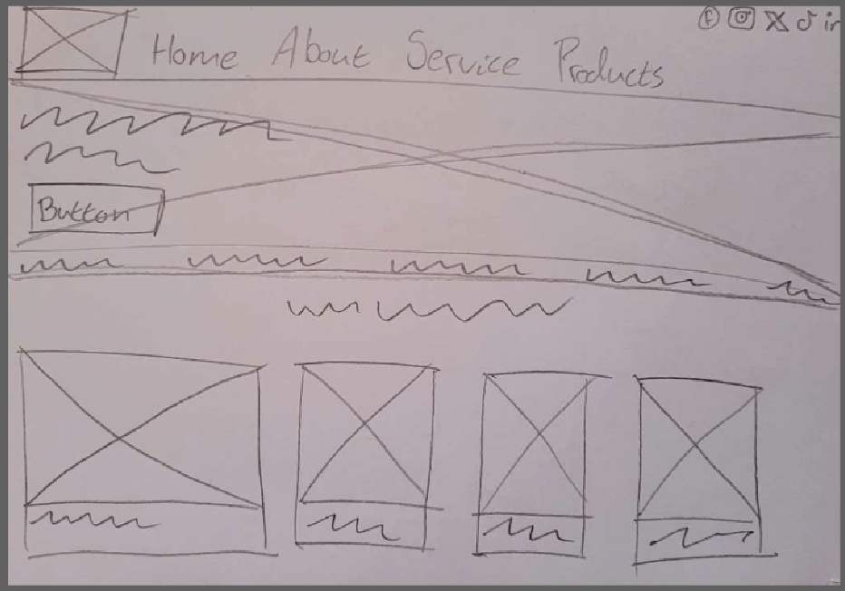
Low fidelity websites can either be a sketch design or perhaps one created using an online software. For my low fidelity though I sketched it out as my mid fidelity would be created online. This is my rough sketch of a low fidelity website. It doesnt look like much but its the first initial step to understand the basics on what goes where and what to include.
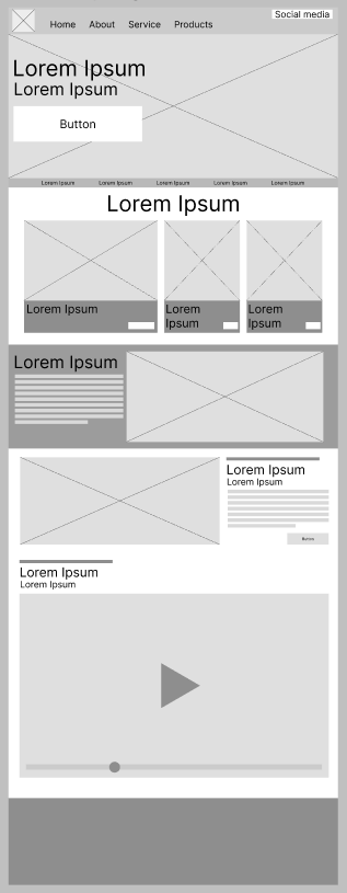
Moving forward to Figma allowed me to improve certain elements and all-in-all gave me a much clearer understanding on positioning and display. With this being understood that would help me create a powerful high fidelity website that guides the users to specific details. It would also mean my website not looking clustered and full of useless information that probably doesnt need to be displayed on the home screen. As created once the user opens the website they are presented with an image that spans the entire width of the screen a memorable phase positioned to the left of it, with a call to action button placed underneath.
The websites colour pallet would depend on the chosen colours I have been using through my design to present identity towards Eco Future’s brand as a whole.
Banners
For this assignment were had to create a series of the banner designs ranging in various sizes. The first banner scale was a wide skyscraper banner with dimensions of 160 x 600 pixels. The second banner was a mobile banner at 300 x 50 pixels in size. Lastly was a rectangle banner with 300 x 250 pixels. Its important that I as a leaning designer is able to create banners with such different scales, as it gave me a real sense of placement and size.
Wide Skyscraper Banner
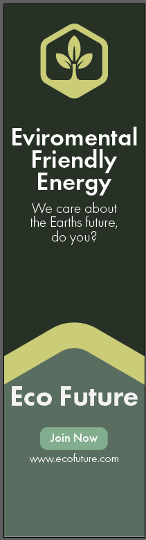
As I mentioned in my second logo design I was extremely fond of the chosen colour pallet. However, I also mentioned I preferred the first logo design. I also changed my previous font to Futura. The original one made my copies of text too big therefor it having to be really small to fit on this particular banner but that causes another issue of making it hard to read for the users. So incorporating all three new features into one I created this skyscraper banner promoting the brief. Out of the three banner designs I created this was the most challenging due to its scale. With it being thin I struggled with the placement of elements, but once I found it out I soon realised this was my favourite. Whilst the banner original final design just had the dark green background it looked bland. So I cut out the top of my logo, scaled it up and used it as a separator. That proves that adding shapes in a different colour can add great interest to designs.
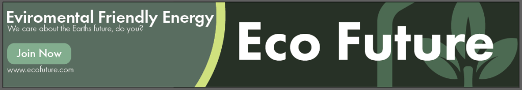
Mobile Banner
This was my mobile banner design so it was extremely long in length. I believe I have managed to convey the message the same way I did in my previous banner. And I kept a lot of the assets all the same to allow familiarity to flow through my designs, it helps with making the brand more memorable. This banner design would work well if the logo was memorable as it is show in this design however not fully and with a slight fade to it. Therefore if the audience did know the brand why wouldn’t need all of the logo to help them know.
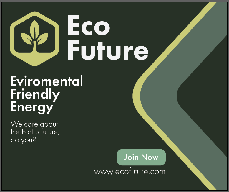
Rectangle Banner
Like with design one and two I kept all assets the same, just had to scale them up and some down slightly due to this banner being a simple rectangle shape. I also incorporated the same design patter from banner one. Using the logo hexagon shape to not only add interest like I did for banner one but this time to take up some leftover space. I wasn’t happy with the original design for this banner with all my text and logo being placed in middle, wasn’t interesting enough. So moving all text to the left and adding that shape in again really helped.
Video Advertisement
Due to the WordPress video limit I have had to publish both finished videos onto YouTube.
For my Eco Future video adverts, I decided to create both of them using After Effects. Therefore these designs would be completely motion graphics. Both adverts show similarities to the banners I created, as I sourced assets and colours from them during these creations. The reason for that is to help promote the brands identity using the same colours/ shapes and fonts. It allows the audience to hopefully remember it just by those key elements.
Both videos were meant to include a hook for the audience. A video hook is the part of the content that grabs the users attention, convincing you to either read on, watch or listen more. A hook can be a short statement such as slogans and mottos or perhaps something you see happening during the advert.
My video hooks consist of using the logo multiple times and slogans. I kept the slogan as short as possible otherwise the audience can have troubles remembering it.