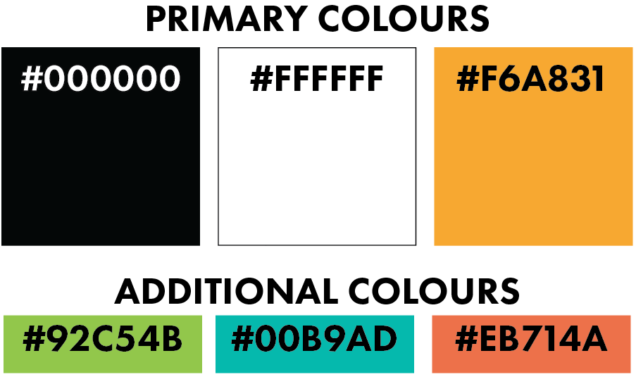
Refreshed brand
To successfully convey the mission of WWF’s organisation, I implemented a design strategy that was both strict and meaningful throughout all elements of design. One of the most important strategy revolves around using three primary colours and perhaps some additional colours to go along side them, but nothing too different. Otherwise the designs could end up looking like a mess. Two out of the three primary colours are used within the brands logo, black and white, whilst the third is a more brighter colour yellow/ orange or to be exact a cantaloupe colour. This selection of colours helps to establish a strong brand presence that resonates with the target audience.
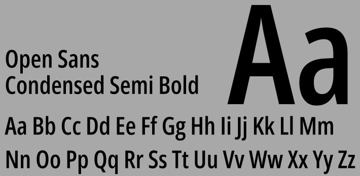
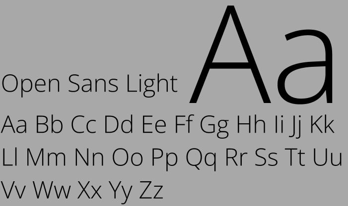
In addition to the colour scheme, the choice of fonts also plays a vital role in the overall designs. One of the best ways to ensure everything is visually appealing for the audience is to choose multiple fonts. However, not many otherwise it makes it worse but enough to add interest. Opting for two complementary fonts is probably the best method. In my website design I didnt choose two completely different fonts, I chose the same fonts just in a different style. Open Sans Condensed Semi Bold and Open Sans Light. These fonts selected were chosen for their clearness and modernity, which further helps enhance the accessibility of the content for the target audience. This is important for a non-profit organisation that aims to reach a diverse audience, especially young individuals who may benefit from their programs.
Once I gathered all the feedback I received and made the needed adjustments for the mid-fidelity stage, all that was left was to create multiple pages to my high fidelity design. Adding multiple pages to a website is a crucial step as it brings life to the entire site as it allows the users/ audience to explore deeper into separate topics about the chosen organisation. After that was ensuring that the prototyping functions were correct across the site. Prototyping helps guarantee that user shall have a easier experience whilst browsing the site.
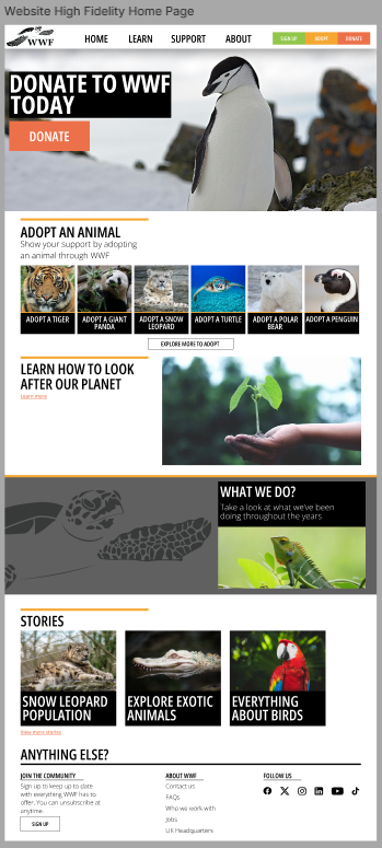

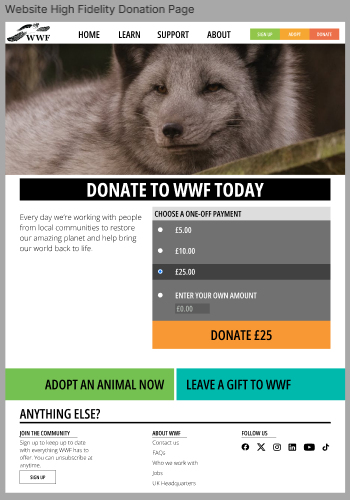
Since WWF is a huge organisations and continues to grow, they clearly have a mass amount of information about what just they do, how they do it and how you can help. Because of the sheer amount of copy I could include in a single website page it worries me it may make the website worse. When users visit these non-profit organisations sites such as WFF they tend to look for two things. Leaving a donation or perhaps wanting too have a read further into the fund. However, if they are here to read you wouldn’t want to include too much information otherwise it may bore the users resulting them on leaving the site. I dont believe WWF’s original website is too cluttered with information, my way around it though was I used the primary pages as a landing page to allow the users to select a sub topic from the previous one.
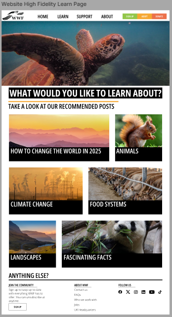
For example as seen on my Learn Page it allows the audience to then select a separate topic on what to learn about. That selected topic would then take then to another page teaching them about it. I believe its a very clear and flow system to provide the users with the right guidance to find what they want to find. I also used that design I created to my advantage creating a similar system on my support page.
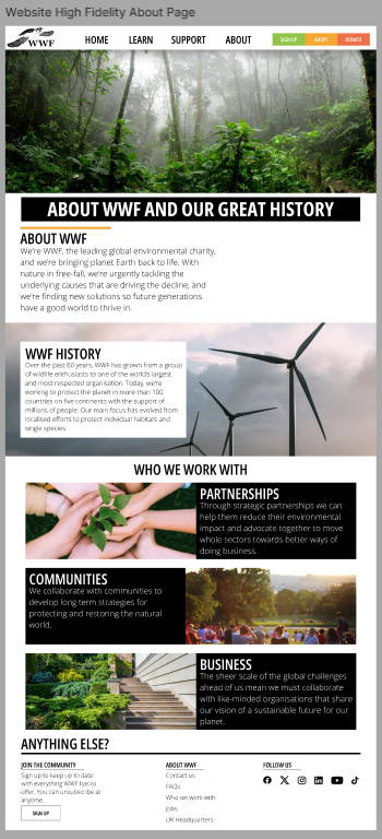
As for my About page I wanted to create a similar system with the previous buttons and elements from Learn and Support. However, I also didnt want my website to look the same throughout each page. I changed the button designs (inspired from WWF) and still created the about page as more of a landing page. But if some users came onto the site to quickly learn the organisations abouts I didnt want them looking through pages to find a specific facts. Which made me place some small copies of text explaining to the users WW’s history and their main goals.
https://www.figma.com/design/4bkkrAehRqjlpUPDESVOTb/WWF-High-Fidelity?t=Mbu4CrvgI9LuEA8M-0
REFRENCES
WWF, 2024, WWF, Accessed on 25/12/2024, https://www.wwf.org.uk/
pexels, 2024, pexels, Accessed on 27/12/2024 https://www.pexels.com/
Real Life Advertising
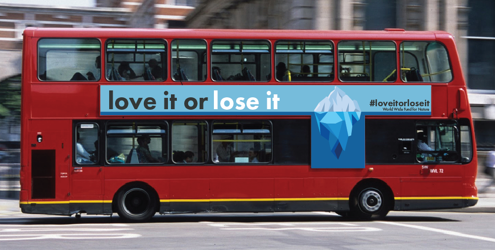
For my public advertisement I didnt just want to be generic and create poster suitable of a variety of rectangular billboards. I also wanted something different such as a bus poster advert. Only issue with those style of posters is what the design is going to be and its placement. With an unusually shape to work with it can cause difficulties. I landed on the idea of creating an iceberg using Adobe Illustrator, using the hight of an iceberg above and under water to my advantage as that would be perfect for the bus poster. And include one of WWF’s phases “love it or lose it”.
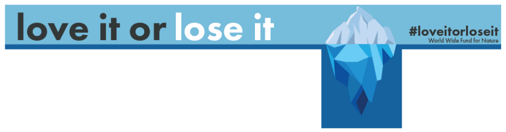
Even though I originally said I wasnt wanting to create billboard advertisement I made use of what designs I created. Again using the previous iceberg illustration I was soon able to create two simple yet distinct billboard posters. Also using the same phrase “love it or lose it”. All three adverts also include a hashtag (#loveitorloseit). As hashtags play a vital role in advertisement as they connect posts to specific topics, making it easier for people to find, understand, relate to and engage with specific content.
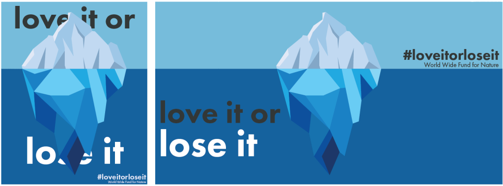
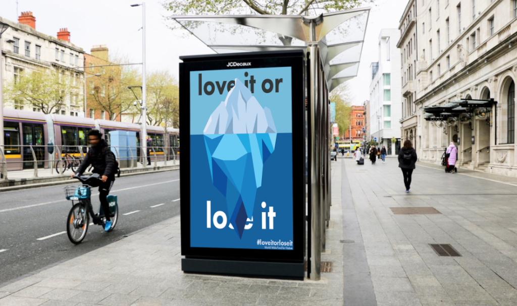
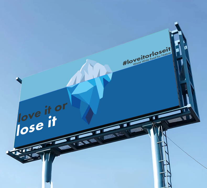
Here are the two designs I created embedded onto billboard templates. The reason I wanted to use the same Iceberg design/ phrase/ colours etc was to ensure people would recognise it. Using same elements such as those increasingly helps with making a design more memorable. Therefor at glance the audience shall hopefully know if only with a couple seconds looking. The two billboard templates were sourced from a free website called Placeit.
REFRENCES
Placeit, 2024, Free Billboard Mockup Generator, Accessed on 30/12/2024, https://placeit.net/c/mockups?f_devices=Billboard
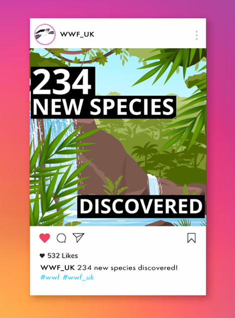
Social Media
In order for my campaign to expand out via being online it’s not only a website that can help. We have been tasked to create a social media post.
I created my POST inside of Adobe Express, they supply you with very simple yet highly effective assets to create all sorts. The proportions were as followed 1080 x 1080px. Not only did I create the post itself but I also added to a an Instagram template including custom name, profile picture and off course the custom hashtags.
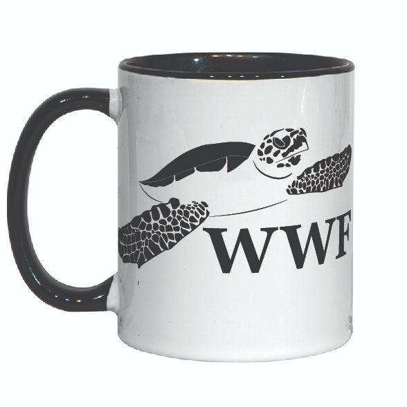
Examples of merchandise
Another step for my campaign was to create some merchandise mock-ups. I chose a to create two types of merchandise, a recyclable notebook and a mug. Both including the logo I created in the last assignment. Placing the logo on the notebook was simple enough, so simple I had time to experiment with its colours. Resulting in the four I have presented. Whilst the coffee mug may have seemed harder to position due to its curves placing the logo onto was just as simple as the books. If anything it was much easier. I used Adobe Illustrators mock-up tool, one of Illustrator Beta tools that allows you to select an image (my logo) select another image (coffee mug) and the program generates your final mock-up by placing the logo onto the mug as best it can. Because it was a coffee mug I chose and not some shirt/ hoodie it managed to come out perfect.
Notebook Merchandise
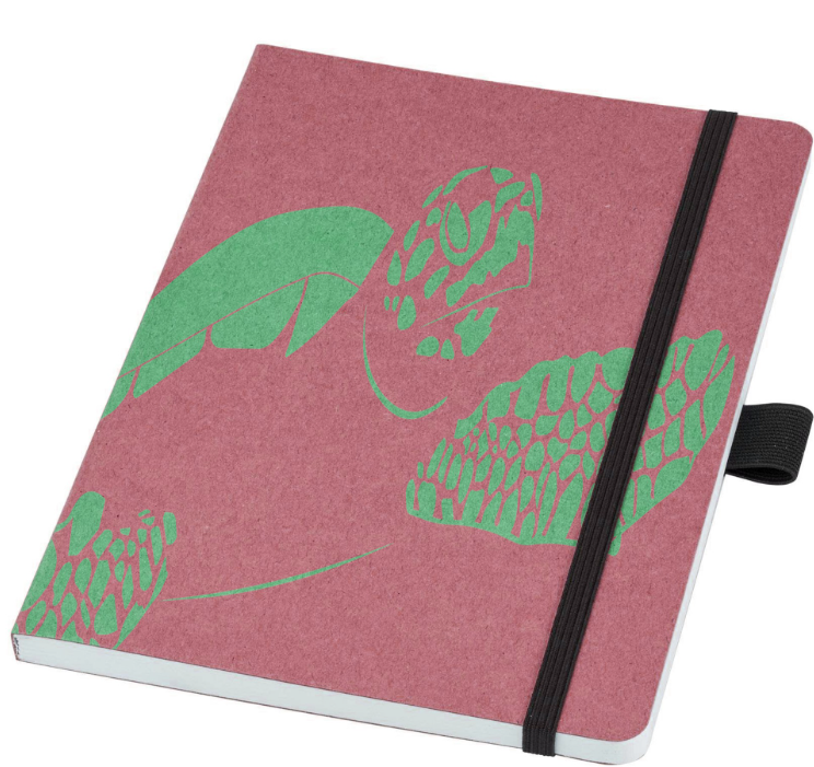
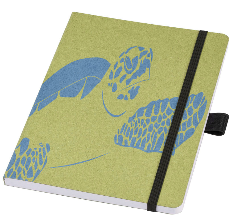
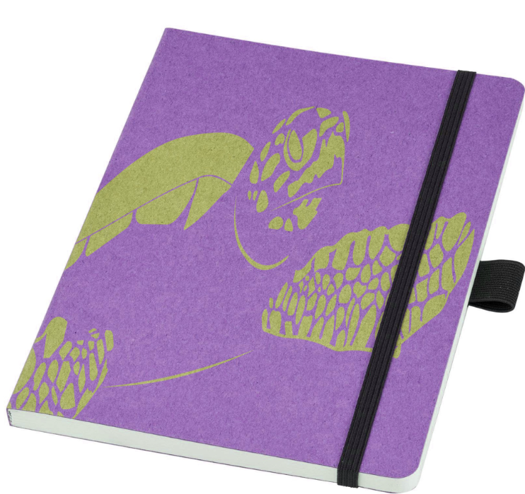
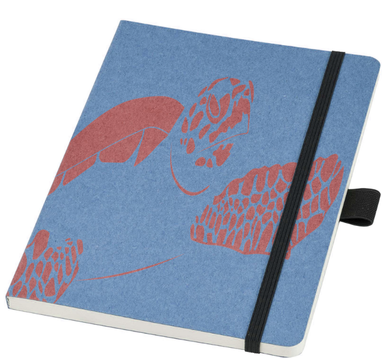
The reason why I chose to create notebooks and mug merchandise for WWF is because most other non profit organisations always go down the route of making clothing etc. Whilst WWF is already very popular with its unique merchandise. Because its such a huge organisation they have the materials necessary to produce pencil cases, lunch boxes, bags, flasks, metal straws, books, pencils etc.
Campaign video
Please excuse my voice, I was full of cold during the time of recording.
0 Comments