Mood Boards
The best way to create a unique/ effective design is to always create a mood board that supplies a collection of elements that may be used in the project. Mood boards help keep the style of the project consistent with a clients goals and expectations. Another efficient way to create good design is to view/ research your competition, you’ll be able to identify any issues or effective elements then later improve them in your own design. To help expand my research I created a collection of mood boards that first explores my competition through logo design, web design, app design etc. And then create my mood board including all my chosen assets/ elements.
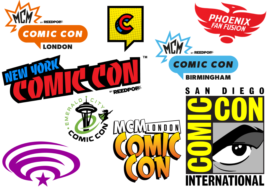
A majority of the popular comic cons such as San Diego Comic Con and MCM Comic Con have a much simpler logo design. This consists of simpler fonts, colour and all-in-all being less crowded. The choice of fonts in those particular logos also make it much more appealing to the audience. Such as the New York Comic Con logo, some may not be able to read or understand what what it says due to the rotation of the text, the two block primary colours, and the comic font. Even though MCM and San Diego Comic Con dont use a so called comic font, their design still represent a comic look to it due to their unique design choices. San Diego Comic Con is designed in a way to look like a comic book, whilst MCM Comic Con includes a speech bubble and the classic comic explosion shape.
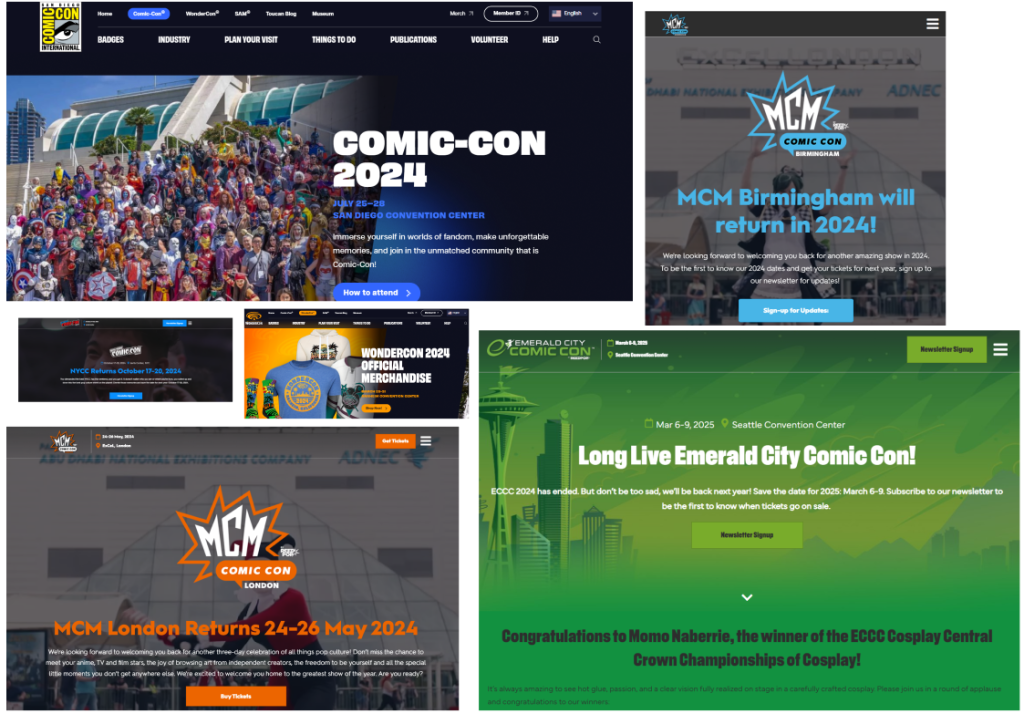
One main factor about a majority of these conventions is that they are held together by ReedPop. ReedPops mission statement goes as followed “We create the world’s best events, websites and video channels for pop culture fans across the globe. We bring fun and excitement to our audiences by creating content and experiences that are original, exciting, memorable and exceptional.” Now because ReedPop are mostly in charge of a few of these conventions such as; MCM, Emerald City and New York Comic Con they are also in charge of creating their websites. Resulting in them looking the same. Some of these similar elements consist of:
- Logo placement
- Calendar and a location
- Interactive button in the top right
- A drop down menu
- And a thin grey separator
Meanwhile Comic Con International has a much different approach, firstly by showing the navigation bar at all time, therefor the view can switch between pages whilst at the bottom of one already. But they also included a smaller header above the navigation bar giving information about what other events they hold. It could be seen as really helpful, however it could result in giving out too much information to the point where the viewer wont know where to look (information overload).
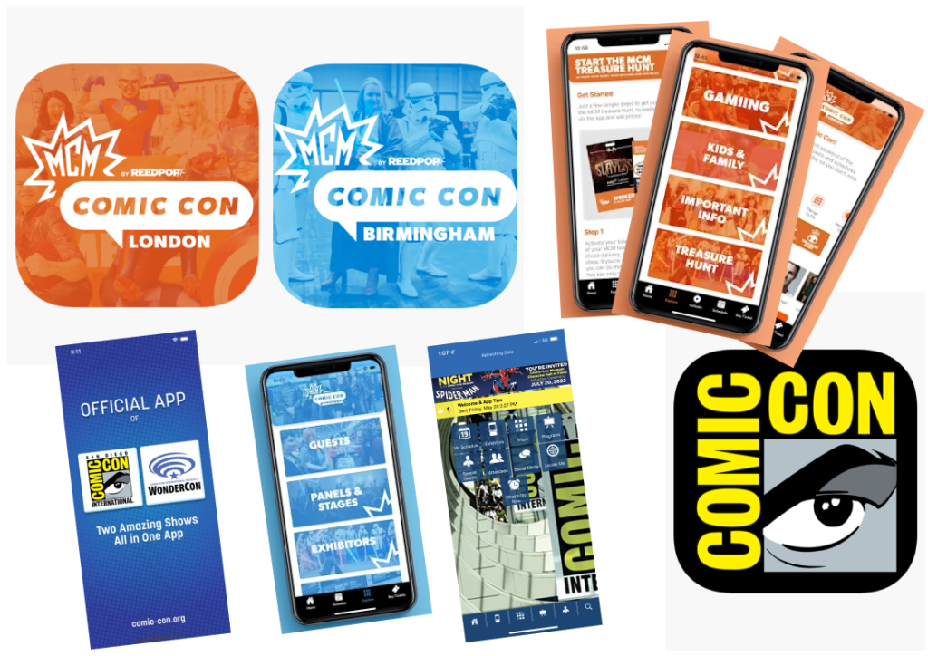
Mobile phone designs are a known to be more simple and straight forward, including less information and interactions as its only being run on a phone and may not be powerful enough to run it so smoothly like a computer could. But because all the information you need can now be accessed on a mobile app its a quicker way to collect information where ever you are.
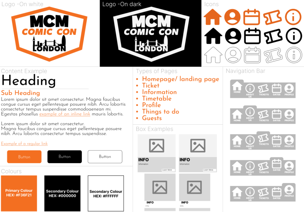
Colour Planning

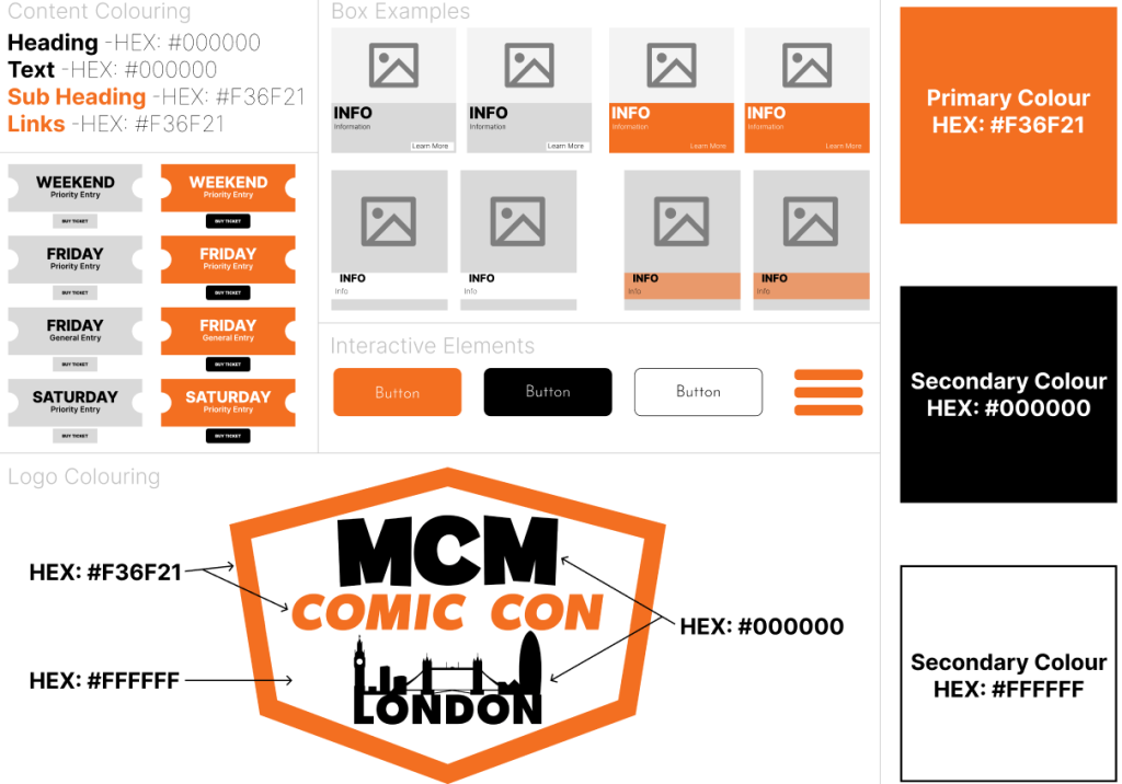
By picking a variety of different colours and shades a designer is able to create great interest, while also conveying hierarchy information such as headings, subheadings. Colour schemes can also be used to organize elements in the design, making them easier to read or understand.
0 Comments