Context
Colour is a universal language and a powerful communication tool. Of all the elements that make up a visual design, colour is perhaps the most vital and influential. Research conducted by psychologists and marketers have highlighted how colour can influence our emotions and perceptions.
[Google, 20 Nov 2020]
Nike+ Advert: Good Design
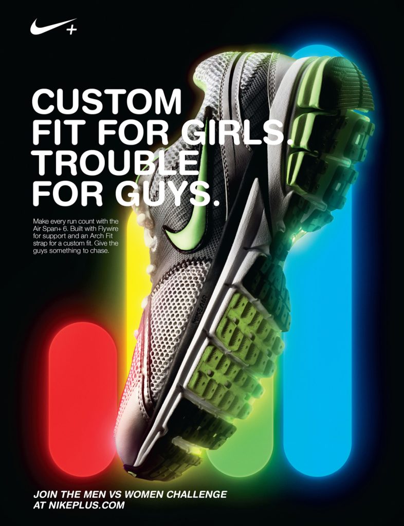
For my good design I explored the use of colour in a Nike+ advert. Colours play an important role in marketing and advertising as they have the power to give out emotions, grab attention, and create a memorable image such as logos. In this case of Nike advertisement, the use of vibrant colours is likely a choice done on purpose to make the shoes visually appealing and eye-catching. And bright, bold colours such as red, yellow, green and blue tend to grab attention. When looking through a magazine or browsing online, these colours can make the shoes stand out from the crowd and bring in the viewer’s interest. Nike has always been known for its daring approach to design. As they often push boundaries and experiment with colours to create visually striking products.
Colours have meanings that can affect the viewers thoughts. For example, red is often associated with passion, energy, and action, while blue can evoke feelings of trust, reliability, and calmness. By choosing colours correctly Nike can create a powerful connection with their target audience. Another reason for why those specific colours have been used is because they are all the other colours that shoe can come in. The background of the advert has obviously been put to black, as that is what gives/ shows the effect of creating a neon light whiles the font is white. This is resulting in an easy to read advert even though the copy goes in front of the image.
In conclusion, the use of good colour in the Nike shoe advertisement is a result of careful choice and a desire to create a visually captivating experience. The vibrant colours not only grab attention but also convey the brand’s energy, passion, and individuality. Nike’s approach to design and their understanding of the impact of colours have contributed to their success in the sneaker industry.
Nike Air Advert- Zero Gravity: Poor Design
For my poorly designed use of colour I’m exploring this Nike Air advert. The main reason why this advert is poorly designed is because colours can evoke different emotions and reactions in different people, however because there is no significant use of them it just looks boring.
Another reason is that the colours used in the advertisement didn’t effectively give out any sort of message or brand identity. Obviously Nike logo is plain black but they could have at least changed the font colour of “Zero Gravity”. So one change I could make is the colour of the text. Although that may seem simple when correcting colour, keeping it simple can sometimes work better and look more appealing for the viewer. If I’m not wanting to add any other colours than what has already included in the advert I’m working with orange and blue. Because the advert is small and doesnt include that many elements I think it shall look better with only a couple of colours.
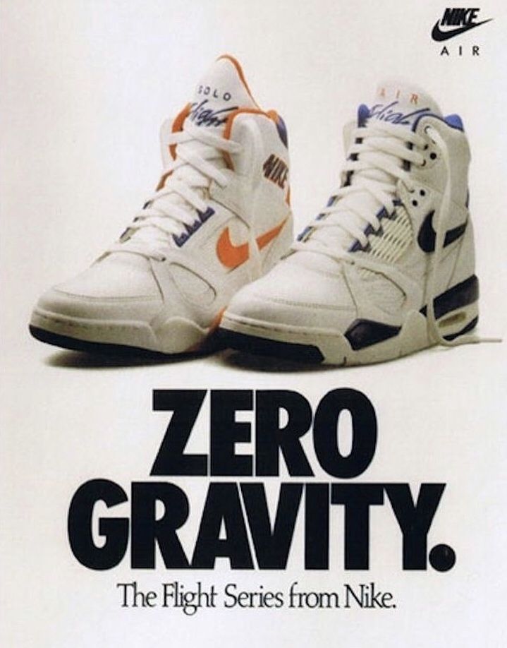

For my re-design I kept it super simple like I said I would, changing the words “Zero Gravity”. They have been changed from solid black to the orange and blue used on the sneakers above. The advert now not only looks appealing for the views but can help give out its message now that something stands out. The colour orange can symbolize warmth, confidence and agreeableness. As its bright it may help people feel bold. The colour blue symbolizes depth, loyalty, trust and wisdom. I also added a slight yellow tint to the background just to make the whole advert pop out not just the text.


0 Comments