Context:
So, what exactly is a composition? Well, in very simple terms, it’s the part where all the separate elements come together to form a whole. When all of your type, your images, your graphics and colours, come together to form one cohesive design.
[Google, 17 Jun 2023]
NIKE Billboard: Good Design
For my good example, still looking at sneaker advertisement, I decided to look at good composition in one of Nikes most popular billboard. In March 2022 was Nikes celebration for Air Max Day, to promote/advertise this they created a 3D billboard in Japan. I picked one specific scene to talk about the composition.

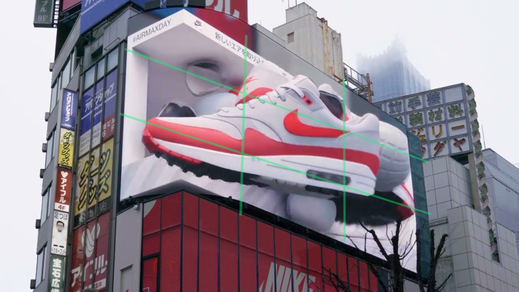
In sense of rule of 3rds the sneaker dominates a majority of boxes in the middle column, this creates a well-composed images that draws the viewers attention to the centre. And because the Nike tick is in the middle box it identifies the brand. Another reason why this scene is well designed is that it includes some copy of text, unlike further on in the ad. We can see the Nike logo in the top left, but we also see #’s. Now because this is is aimed towards a younger generation they can easily go on their phones and type that # in any social media platform and read what this ad is promoting. Because the text is out the way, and much smaller compared to the shoe the audience is distracted from the main subject. This results in good composition and well designed elements.
All the colours in this scene match, therefor theres nothing that will draw the audiences eyes away as soon as this pops up. And because this billboard is an animated video there is not one scene that makes it look empty. Theres always something in the background behind the shoe, ensuring visual engagement. An the fact that this is a 3D animated billboard with sound other viewers may be attracted to it from the illusion it will create, resulting more people getting into the style of Nikes footwear. Or at least looking at the shoes online and sharing with friends.
NIKE ID Billboard: Poor Design
For my poor example I picked another Nike billboard promoting Nike ID. Nike ID is a service allowing customers to personalise and design their own Nike merchandise such as clothing, sneakers etc.
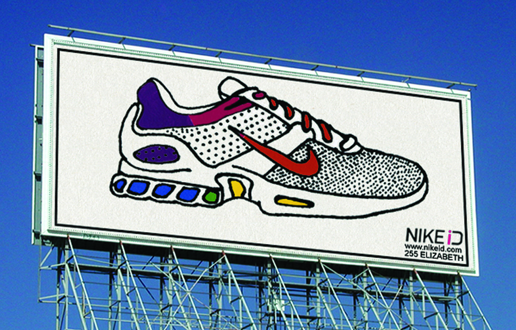
Billboards must include effective composition and placement to capture the attention of passing drivers (if built near a road). When glancing at a billboard, viewers should be able to see a variety of elements, including not only the main image but also any text placed around it. Unfortunately, this particular billboard suffers from poor design choices. The main image dominates the space excessively, overtaking the text positioned below it in the corner, which is too small. Drivers may not notice the text altogether, as their eyes will be naturally drawn towards the image, especially due to the vibrant selection of colours used in it.
Advertisements for sneakers often benefit from a slight rotation, as it adds an interesting element and creates the illusion of using more space.
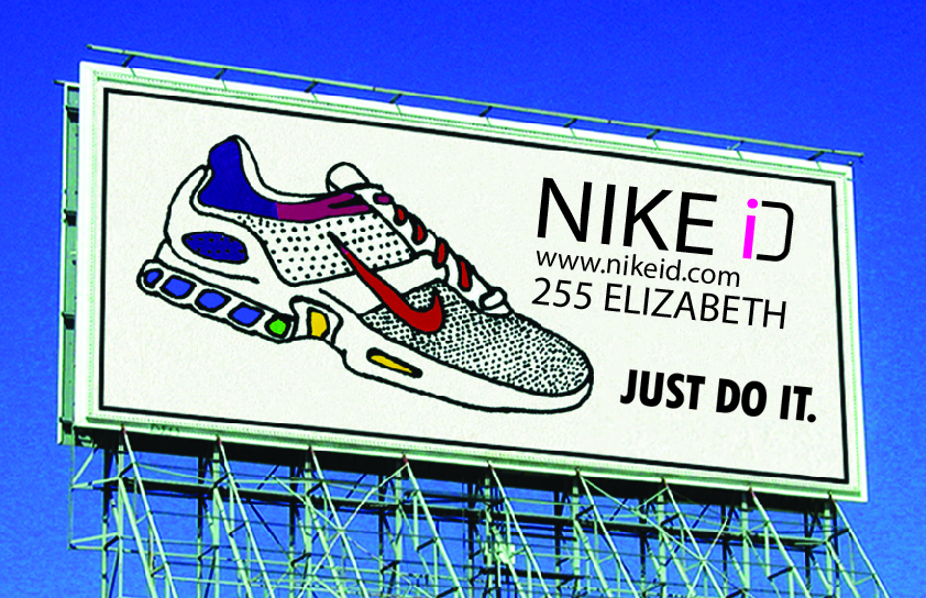
For my redesign the copy is significantly enlarged from the bottom corner to make it readable when passing by. Because I shrank the sneaker and rotated it slightly facing down that gave me space above toe box to place the copy. The text is kept on the right hand side therefor the audience shall hopefully look at the shoe, realise its a Nike ad by the tick and follow the shoe down to were its pointing (the information). As I changed those two key elements I was left with a section of white space under the copy. So I simply added Nikes slogan “JUST DO IT.” to fill in the space. Although the font from the slogan and the ad doesnt match at all, I still had to keep it the same as Nikes font is Futura Extra Bold Condensed.
The billboard now fulfils its purpose as its much easier to read from a further distance.


0 Comments