Context:
Typography is the art of arranging letters and text in a way that makes the copy legible, clear, and visually appealing to the reader. It involves font style, appearance, and structure, which aims to elicit certain emotions and convey specific messages.
[Google, 11 May 2023]
Sneaker Freaker Magazine: Good Design
For my good example I decided to look at a sneaker magazine. There are multiple reasons for why this is designed well, one being the masthead. Normally mastheads tend to be the biggest piece of text on the cover however for Sneaker Freaker that isn’t the case. They cut a section of the top into a rectangle which ends up including the masthead, barcode, and issue number. Kind of like a header. They do this with every front cover they design, therefor its very memorable for its audience who want the read it. And the fact the masthead is designed in such a way that the last five letters in each word match. The font of the masthead brings out a classic American High School vibe, and even though it may look like a serif font because the letters have feet extended to them its classed as a slab serif font. All the other fonts on this cover are sans-serif, this is for the better as the audience is probably aimed at a younger generation and they would prefer the text to not include the excess elements, that can make it harder to read.
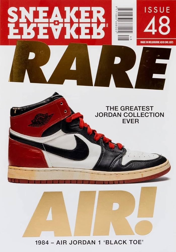
The colours in this house style match well together as the red, white, and black is the traditional colours for the Air Jordan 1. Which is considered a “rare air”. Depending on the colour of the shoe, the colour of the text and large rectangle at the top will most likely change to fit their specific house style.
Even though this front cover doesn’t include many coverlines, I feel like its already filled the page. Especially with the text “RARE AIR!”, we have one small easy to read cover-line because it’s in a black sans-serif font with a white background.
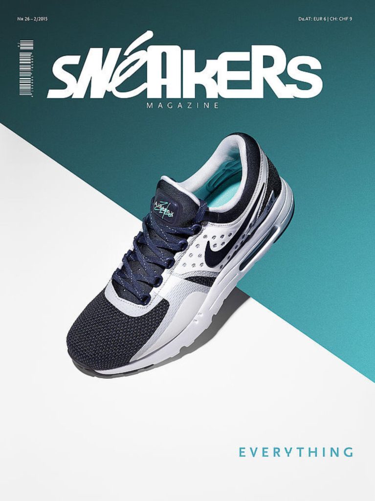
Snéakers Magazine: Poor Design
For my poor example I researched more sneaker magazines. The main issue with his front cover is how empty it is. Therefor, how little typography has been included. As good as the colours go well together matching the shoe, they are no other elements around it to make the cover more interesting. The masthead is built up of a variety of fonts all of them being sans serif fonts. Some letters are capital whilst some are not. But the different fonts don’t work for this genre of magazine. The audience would not be pleased to see it, however because it most likely aimed towards teenagers, they may not be bothered about it at the time. Even though the masthead is too decorative it certainly makes it memorable. So, if a reader sees the magazine and is a fan, they will probably already know what its going to included inside. All-in-all the front cover is just plain boring, it lacks creativity around and below the shoe. Even other graphic elements such as puff boxes can grab more attention. The barcode is also positioned in the wrong place, they look better out of the way from a masthead.
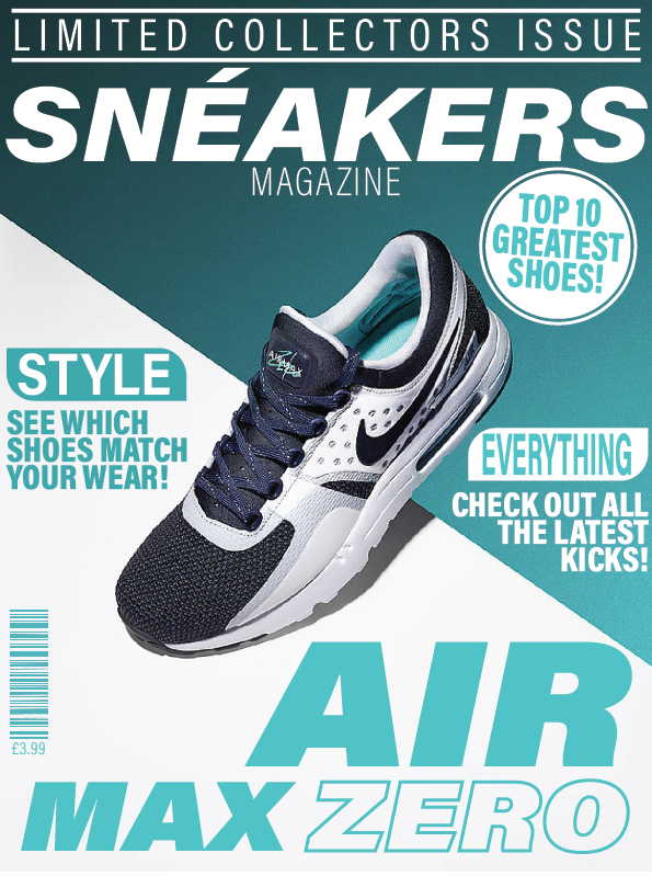
Firstly I added coverlines, therefore I showed more use of fonts and their colours. All copies of text have been matched with colours used from the original background, as the navy blue from the shoe wasnt suitable anywhere. The barcode is now positioned away from the masthead so its not in the way and doesn’t draw the audience somewhere else. All fonts have been changed to a sans-serif, and all remain single colours. Except for the “ZERO”, I removed the fill and added a stroke as 0 represents a quantity of nothing.


0 Comments