When I wanted to create a logo for my shoe brand ‘AirStar’ I was uncertain how it would be done. I wasnt sure if it was going to be a conceptual logo or a standard text logo etc. So whilst experimenting i started using the star shape a lot.
I started using the star with wings that can be seen on the side of the shoe design. But all of them ideas wasnt memorable enough in my opinion. I thought there was too much going on. Because my target audience is a younger generation I wanted it simpler as that may appeal to them more effectively. For instance, the Nike logo is a tick, the adidas logo is three stripes. And now my logo is Astar.
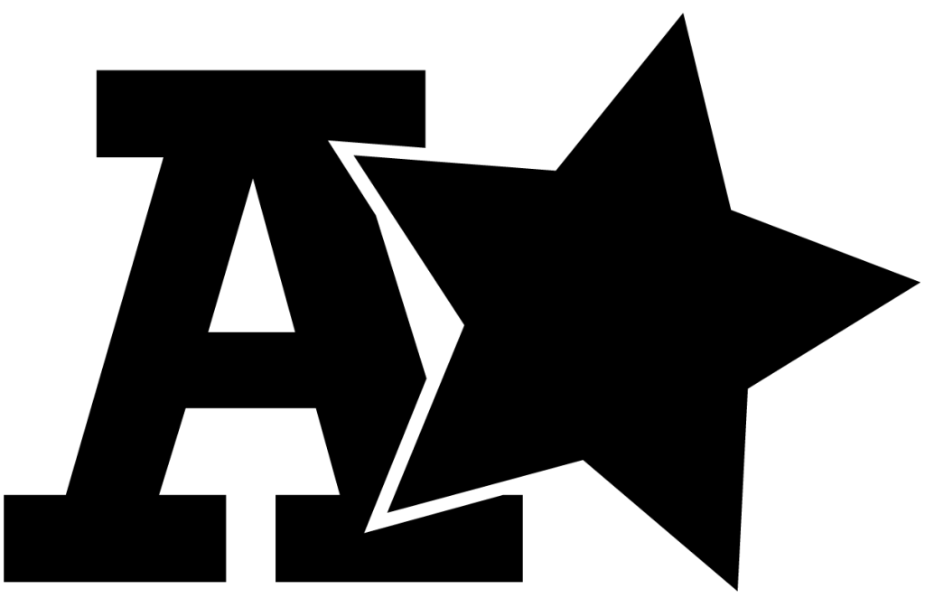
I used the Rockwell font as that is the closes font I could find that gives the vibe of a high school font. And whats the main goal of leaving high school? To achieve an A star, which is what gave me the idea of my logo being the letter A with a star next to it. I created it using the pathfinder tool in illustrator. After giving the letter outlines I placed the star slightly on top of it. Trimmed it, then made the star slightly smaller to give that separation between the two shapes.
0 Comments