Typographical graphic standards were the first thing I had to do when starting this particular project. These three elements would be the most important thing throughout this module. As I have to constantly reflect on these when making my designs later. The three elements I focused on was font style, my colour pallet and my logo design.
Font
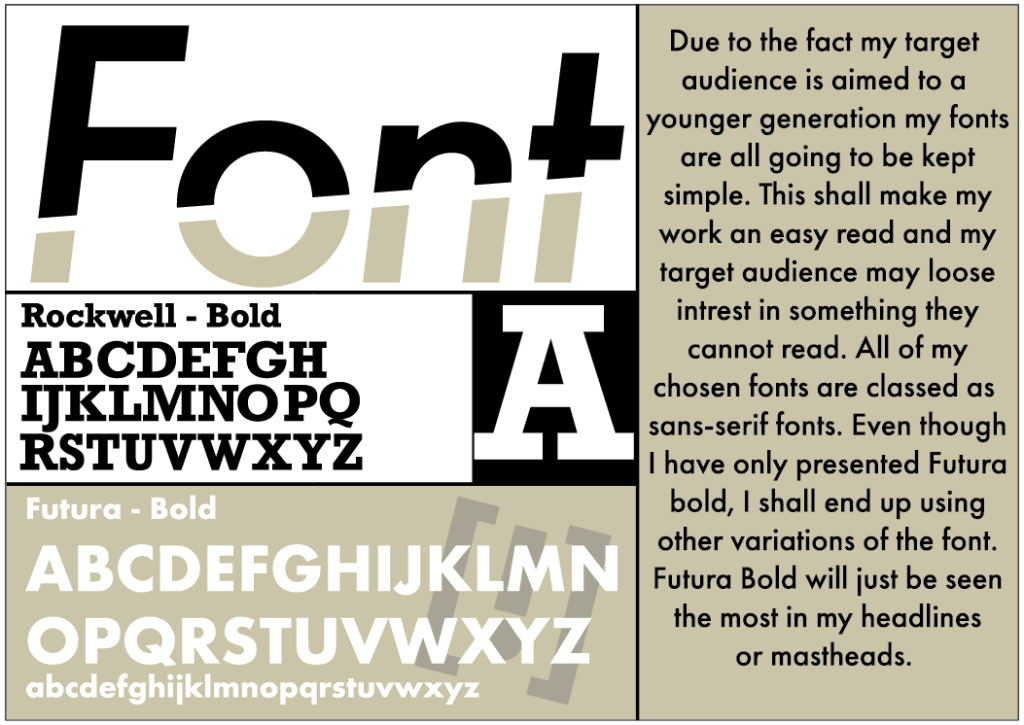
Now because my target audience for this project is a much younger generation such as mid teens/ young adults, I had to pick a variety of easy readable fonts. Without a doubt I picked Futura as that is such a well know/ simple looking font. It has an easy read to it, its sans-serif and all-in-all its just appealing to look at. Even though I only sectioned out the bold version of Futura that is because I shall be using that version more out of the rest. It shall be used for a majority of my headlines/ mastheads due to its great boldness. But I shall definitely use slimmer version for my smaller/ less detailed coverlines. Another key font I shall be using within my designs is the Rockwell font. Again another bold easy to read font, however this font shall only be used within my mastheads/ logo designs. Because this font is seen as a slab-serif font, the slabs on each letter end up filling up a lot of whitespace when close together. So unless they are used as so called mastheads, even though the letters would be even bigger as the mastheads tend to be, the font wouldn’t be used that much anywhere else. Or in a logo I may only end up using one letter.
Colour
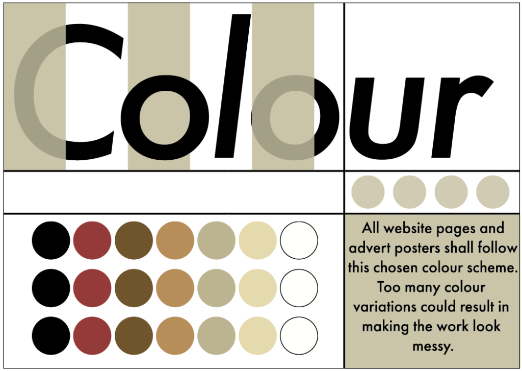
Unlike a majority of colour pallets mine is quite big. The reason for that is that these are all going to be used somewhere in the shoe I make. And to keep the work looking consistent I’m going to be using them when design the other pieces of work, such as website pages and advert posters. Here is the list of the colours HEX code and RGB from black to white.
HEX: #000000 RGB: (0,0,0,255) HEX: #943b3a RGB: (148,59,58,255)
HEX: #70542c RGB: (112,84,44,255) HEX: #b78e5a RGB: (183,142,90,255)
HEX: #bcb490 RGB: (188,180,144,255) HEX: #e5daad RGB: (229,218,173,255)
HEX: #ffffff RGB: (255,255,255,255)
My original colours was a pallet of different tones of yellows. In reference to the AIR’STAR’. However later realising that my shoe just look bland and boring. It also impacted the adverts as they were harder to make appealing. From all the bright colours it just made them look messy.
Logo
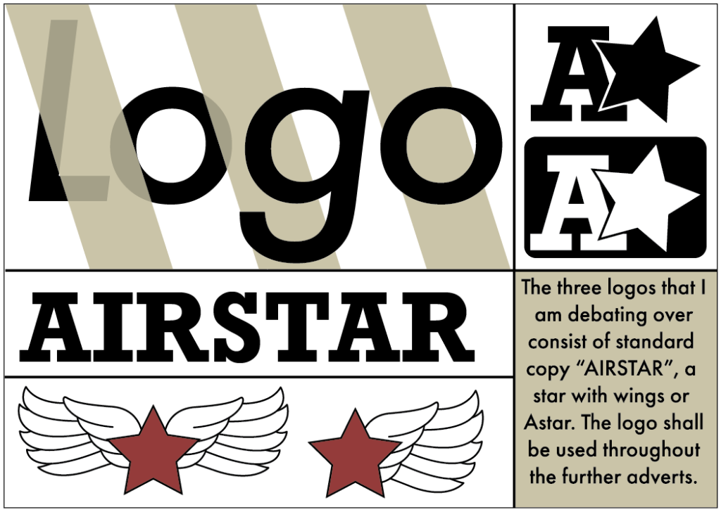
For my logo ideas I wanted to create a variety of design. One simply being text, one being an image that represent the brand, and one including some text followed with an image of some sort. I wanted to make sure the logo was memorable, that already crosses out the text logo as my audience may forget the name. The star with the wings could work as they are always going to be seen on the side of the shoe, however because my audience is teens they are still going to still be in education. And whats the best thing to get whilst in education? An A* or better yet a pair of A*’s.
0 Comments