Research & Context
The research I gathered from looking online gave me a clear understanding on what online safety campaigns are really about. They put all their focus into one individual topic therefor they can keep similarity within their designs and advertisement. Allowing their brand to keep consistency which helps form memorability towards their intended target audience.
Similar campaigns around the country
- NSPCC Leeds Online Safety Campaign
- TESCO mobile It pays to be connected
- Safer Internet Day
- Stop Cyber bullying Day
- Professional Online Safety Helpline
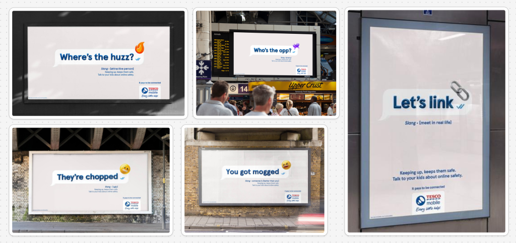
These billboards are great examples of an online safety campaign. TESCO’s target audience here is mainly towards the parents, as these billboards present terminology their children might be using online whilst the adults not knowing what it really means. As we move ahead in time ‘slang’ terminology only ends up expanding further. So TESCO mobile created these billboards that include some popular or perhaps hurtful terms kids may be using, with the definition underneath of what it really means. Therefor the parents can have a clear understanding what their kids might be saying, if they are not familiar with slang terminology.
These are valid design choices that allow online safety campaigns to not only be targeted towards the younger generations but also the parents too. And these are what gave me the idea of also targeting my campaign to the adults in order for them to pass the information down to their children, as the children should find their parents more trustworthy.
References
Ads of the World (2025). Tesco Mobile: Tesco Mobile Online Safety [online] Available at: https://www.adsoftheworld.com/campaigns/tesco-mobile-online-safety (Accessed: 14 April 2026)
Conceptual Development
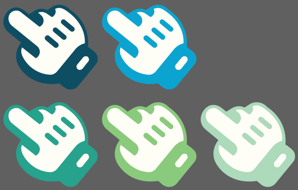
For my idea generation I wanted to create a campaign that would not only warn users about online safety but one they could grow familiar with and trust more. Like most modern brands I also wanted mine to be more unique than the others. So I did further research looking deeper into pre-existing online safety campaigns, I noticed one key detail that followed through a majority of their designs. When they create posters/ billboards they all end up using similar graphical icons. Icons such as padlocks, shields, web browser logos, alert sirens etc. So for my campaign I am going to avoid using them as much as possible and perhaps create my own ‘unique’ icon to make my designs stand out over the others.
I did some further research on font and colour choice for online safety campaigns and they impact they have depending on how they look and how they are used. A Geometric Sans-Serif font could be considered as a “Safety Standard”, whilst a Heavy Grotesque font is used more for “Urgent Alert” scenarios. A more Rounded Sans-Serif is perhaps “Friendly/ Family aimed” and a Traditional Serif is more “Trustworthy” for the users.
For my colour palette I am pushing towards greens and blues instead of reds. While red is great for a one-second “STOP” warnings, it’s usually the wrong choice for an educational campaign. Especially when I’m wanting to address to the audience the importance of a single click. Towards online safety campaigns blue signals authority, calm, and reliability. It tells the user that you can trust this advice. And green is globally recognised as the colour for “Go,” “Safe,” and “Secure.” It lowers a user’s heart rate and creates a feeling of relief. It’s perfect for showing “Protected” states or successful security updates.
Experimentation & Prototyping
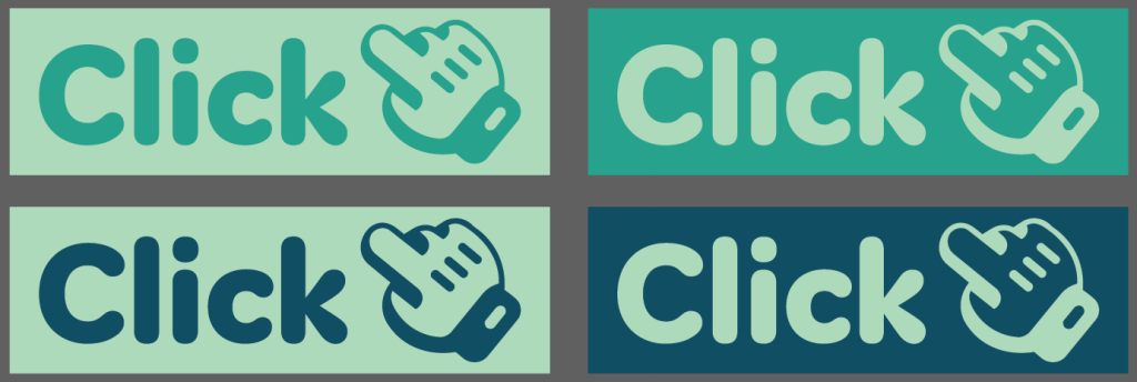
As I mentioned in my conceptual development and further research, I wanted my house style colours to be greens and blues. Therefor instead of having black used within my design i picked out a deep teal to replace it. And for the white i picked out a more cream like colour instead of industrial white. The reason for both of those changes is because it helps create a more approachable trust which is perfect for my online safety campaign. Some of these colours where sourced from coolors for extra help and understanding.
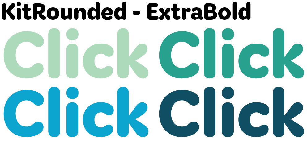
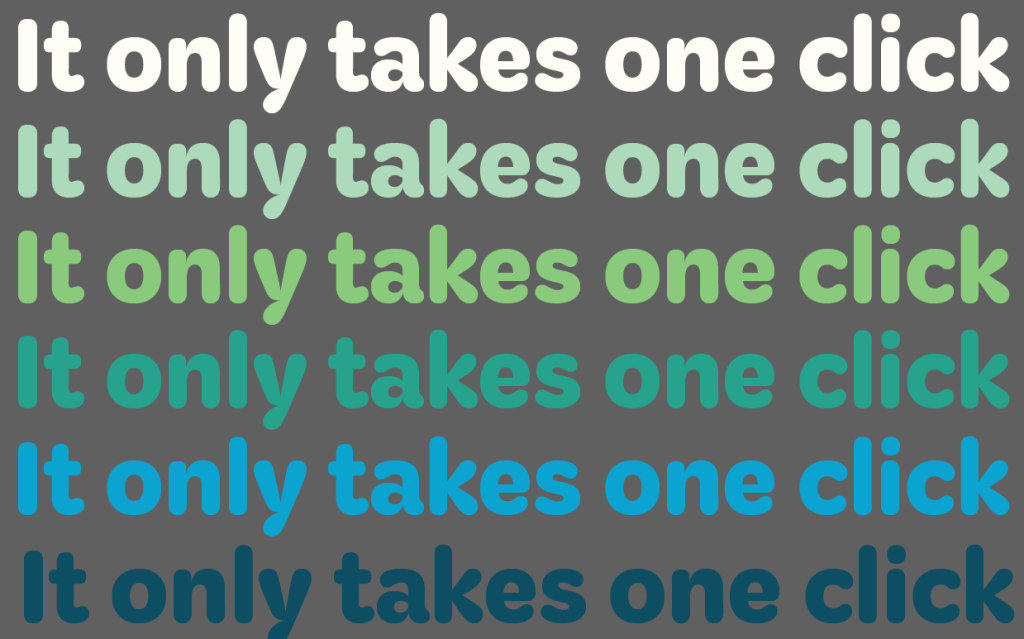
For my font I mentioned earlier that a more rounded style is considered friendly, that like the colours also fits in well towards my campaigns cause. The font i sourced is a called Kit from the Adobe Creative Cloud. It is characterized by its rounded, warm, and highly legible design, often used for headlines, branding, and user interface design to convey a “boldness, sincerity, and expertise”. Below is the font with some slight colour experimentation, this helped guide me as to which colour sits best with a white background. In my opinion its the deep teal. I was able to preform this test in Adobe Illustrator, with my clear understanding of the software I can now carry out this technique into future project to come.
Whilst experimenting with my colours form my text I was also able to use the same skills as earlier to test them out on my logo. Giving me the same understanding with which colour sits best with the white in the center of my logo.
References
Bianchi, F. (2025). Coolors. [online] Coolors.co. Available at: https://coolors.co/. (Accessed: 24 April 2026)
fonts.adobe.com. (2026). Kit Adobe Fonts. [online] Available at: https://fonts.adobe.com/fonts/kit. (Accessed: 24 April 2026)
User Testing & Feedback
Once I tested and experimented with my design choices I presented them to peers and even friends who wont have as much graphic knowledge as me. I showed them the examples from my experimentation and prototyping stage, allowing me to have a clear understanding on my colour choice, visual hierarchies, placement and structures.
I also sent in some of my medium fidelity designs for my billboard layouts and poster structures. The feedback that I received suggested that some of my text should be different in colour. Allowing my audience to have an easier understanding on what bits are considered more important than the others.
I took this feedback into account as I had similar designs that had this issues. As a result, I refined my layouts by darkening the font in the middle allowing the users to realise what information is considered more important to others, which is a crucial point in online safety campaigns.
Informed Design Decisions & Direction
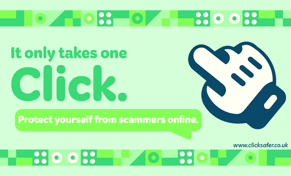
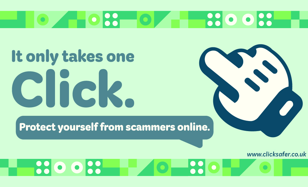
Once all of my elements was created and had all the needed feedback from my medium fidelity designs I was able to finalise them. For my billboard designs I created using Adobe Illustrator, I then saved them out as a JPEG format allowing me to use Adobe Photoshop and create final mock ups presenting how my work would look in the real world. Because I wanted to create a couple of billboard designs I focused each one with a specific aim. One to advertise the campaign more whilst the other would supply more information and provide an education feel to it.
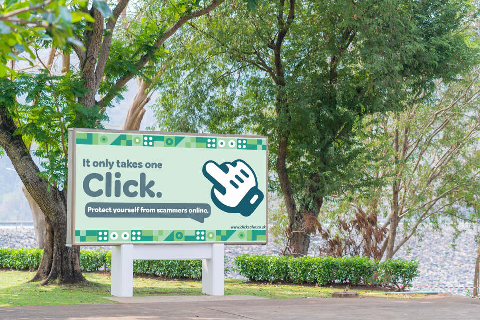
I really like how this design came out in the end, everything fit to scale when I added it to the billboard so no information/ detail was lost in the final preparation.
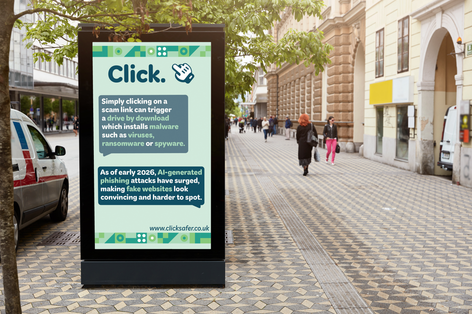
Thanks to my feedback I received in my user testing stage about my first billboard design I was able to take that into account with my other designs. Changing the colour of the chat bubbles to a darker blue rather than one of the greens allows the audience to understand the separation between important information and generic design elements.
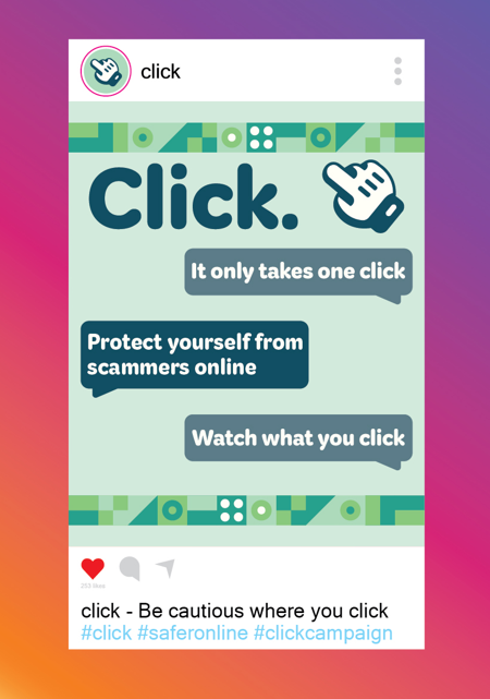
If I had planned my time of creating my final designs more clearly, I would have created some form of motion graphic for a social media post, however I was still able to create a more generic post that address the cause of my campaign.
0 Comments