For my final animation I was tasked to create an animated advert in the proportions of a phone ad. As previously done in my last animation creating another storyboard for this one was just as crucial. Especially for this animation that needs to include animated elements like text and functional buttons. To allow consistency to flow within this advert I made sure I used the same design choices I chose last animations, such as colour and fonts.
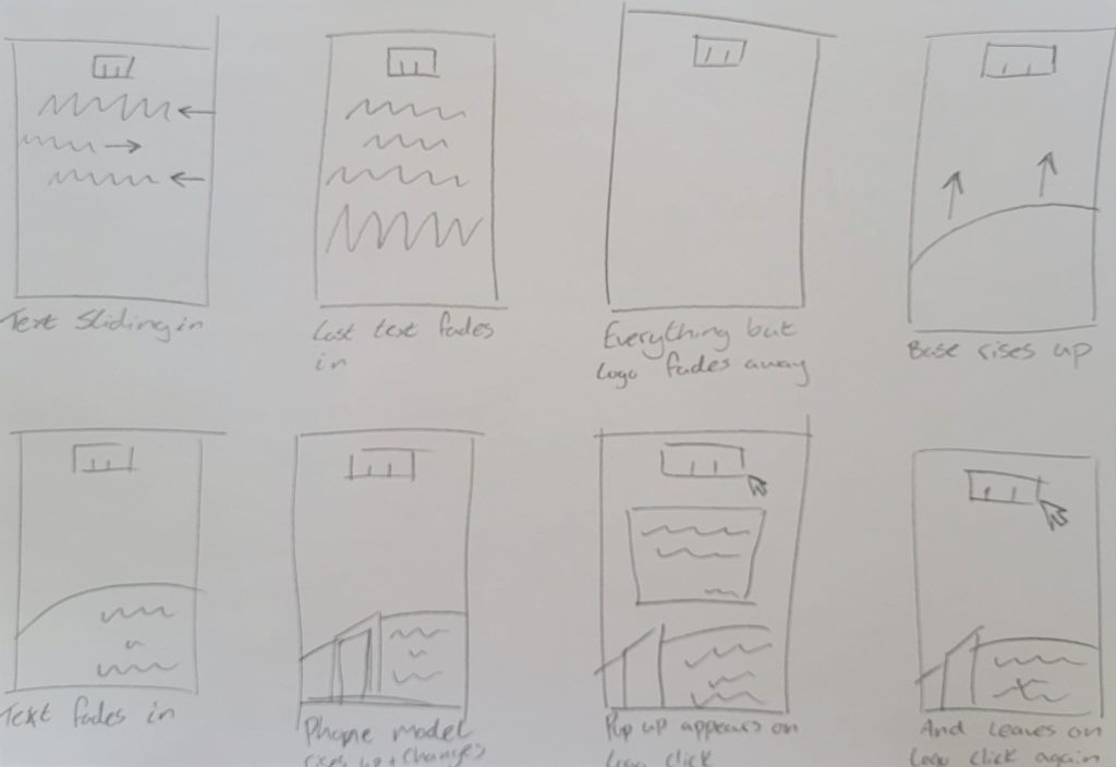
Storyboard
As rough as this storyboard may look, I can get an idea on how I want it all to play out within my designated time I have. I want to animate the text appearing in a couple of ways. Sliding in and fading in, both techniques I learnt in the exercises in class.
Design process
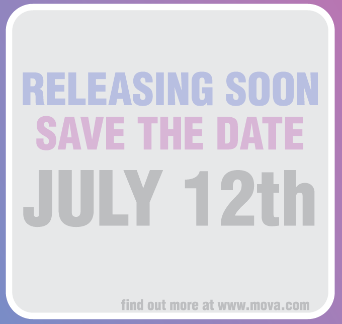
Because this advert is different in proportions to my last two, I made sure the placement of text was centred in the middle of the opening scene. This allows the audience to understand this is clearly an important piece of information being supplied to them for my venue. Using the font Helvetic in my designs also helps readability throughout this animation.
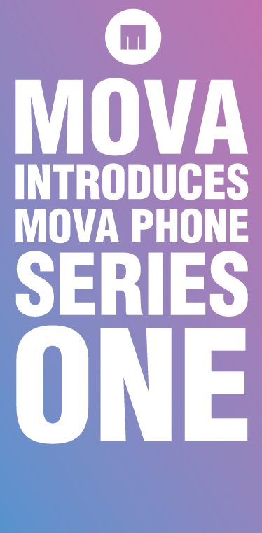
Because I didnt just want to animate the text for this advert I added the two phone models I had been using in the last two animations. They appear later in the advert just after the base and new text ‘BLUE OR PINK’ appear. Since the original opening text has faded away by now that allowed me enough time to present my button to be present whilst the phones at the bottom cycle through the two colours.

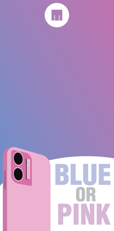
To allow effective information to be delivered about the phones selling at my venue, I designed the pop up to be a release date text box that also gives the users information to find out more at MOVA’s website.
Animation
0 Comments