My animation storyboard consists of ten scenes that present my plan/ transition of my metamorphosis animation.
Scene One
Scene one marks my first introduction to the animation. It’s essential to showcase the brands name effectively. In doing so I plan to create a simple fade-in effect that presents the Replenish brand in a visually appealing way. The text will be white, contrasting against a beige backdrop. This choice ensures full readability, allowing viewers to easily understand and recognize the brand name at first glance. The fade-in effect will not only draw attention but also set a calm and professional tone for the animation, making it inviting for the audience. As the text fades in, I could incorporate a subtle sound effect that fits along side the visual. But my initial goal is to create a memorable first impression.
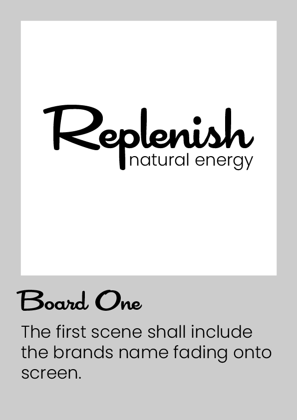
Scene Two & Three
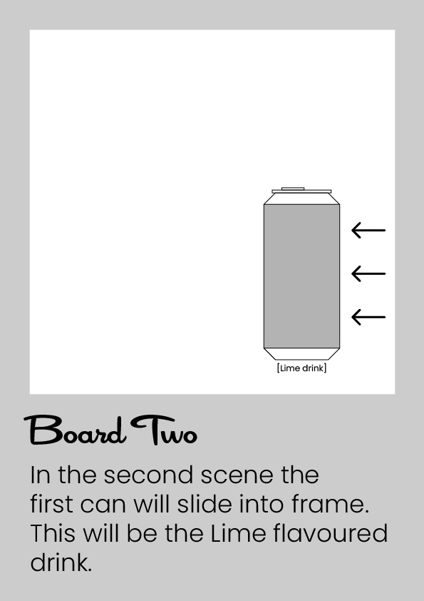
In scenes two and three, the focus will be on introducing the drink cans, starting with the [lime drink] followed by the [blood orange drink]. Each can will slide into the camera frame from the right side, creating a smooth entrance. This is the first opportunity to showcase the unique label designs of each drink. Allowing the audience to get an idea on colours and fonts incorporated to the brand ‘Replenish’. By allowing the cans to glide in at a reasonable speed, the viewers will have a chance to appreciate each visual detail.
Scene Four & Five
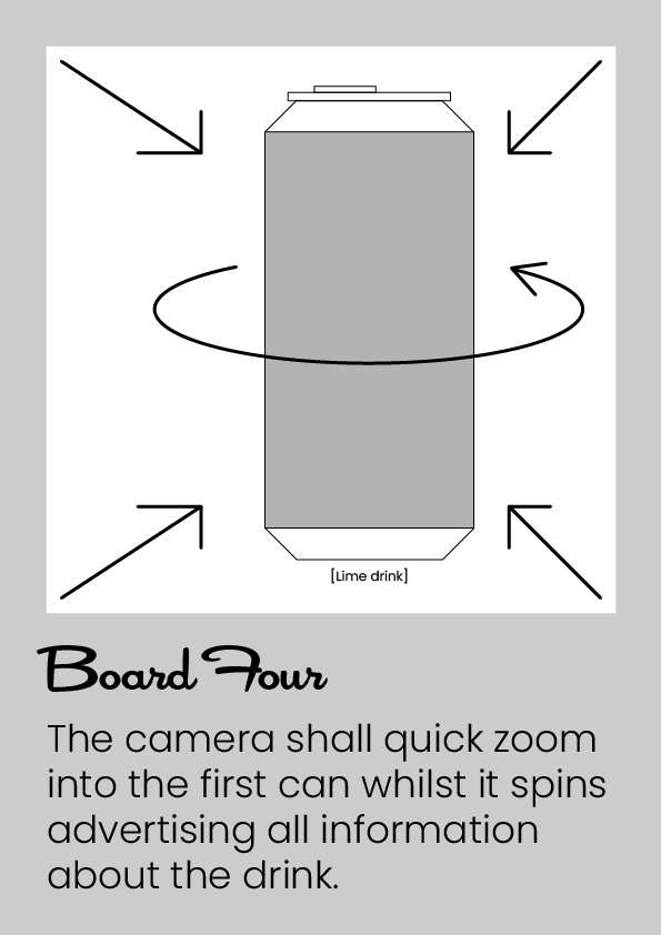
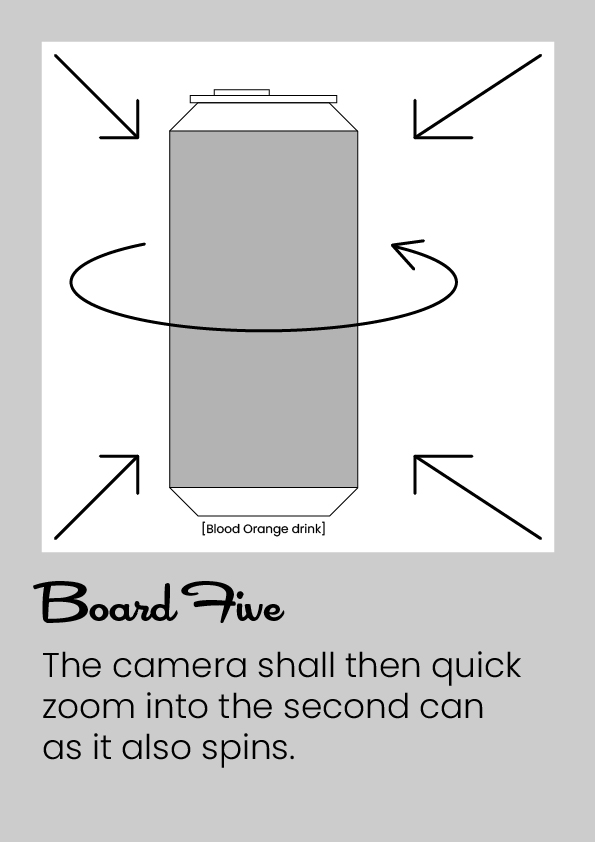
Scene four and five are the points in the metamorphosis animation that advertises the drinks close up. Starting with [lime drink] the camera quick zooms/ pans towards the can whilst it rotates side-to-side. Since the blood orange drink is further away in scene three the camera shall zoom out from the lime can and zoom back into the left towards [blood orange drink] during scene five.
Scene Six
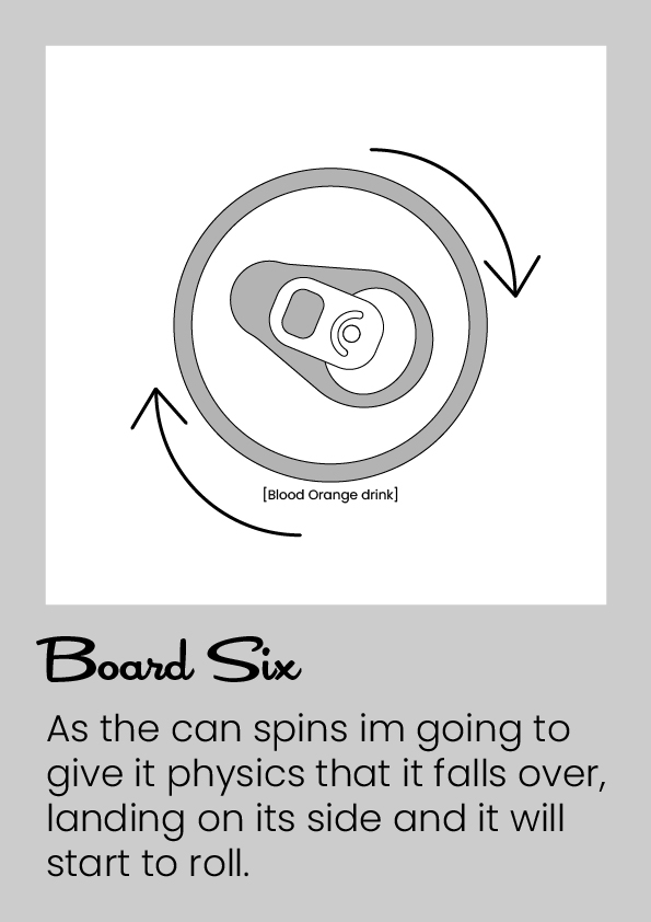
Scene six is the first step towards my metamorphosis transformation, as the can rotates in front of the camera during scene five the can tips over. Previewing the top of the can centred in the cameras shot it will begin to act like its rolling on its side.
Scene Seven
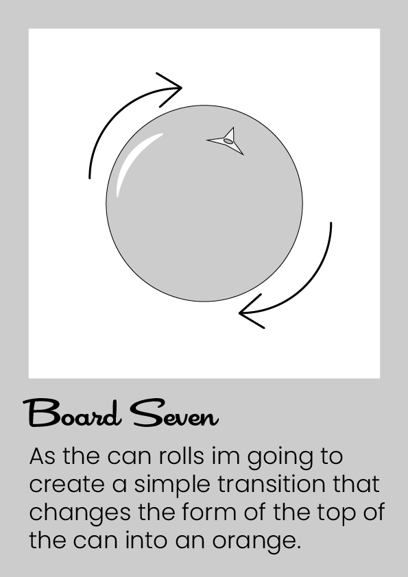
In scene seven, the top of the rolling can transforms into the blood orange, symbolizing the flavour of the energy drink. This visual connection emphasizes the fresh and vibrant essence of the fruit flavour. Eventually, the rolling orange will come to a stop as it nudges against a new drink can, creating a seamless transition.
Scene Eight
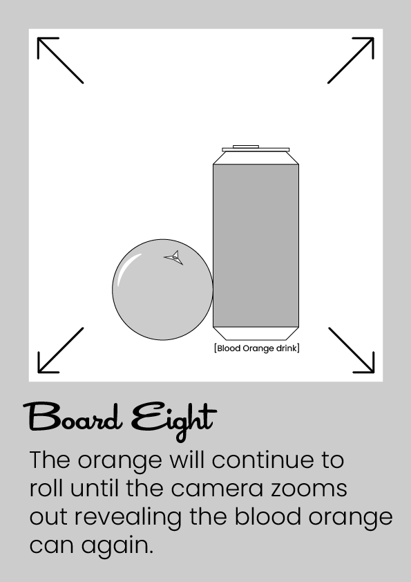
Once the orange stops rolling the camera will quickly zoom out revealing to the audience that both object relate to each other hence the flavour of the energy drink.
Scene Nine & Ten
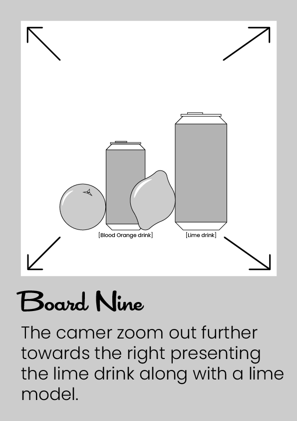
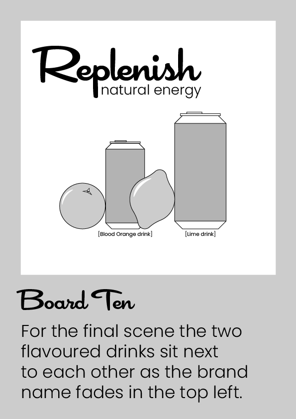
These last scenes, nine and ten will include a further zoom out from scene eight to present the second flavoured drink [lime drink]. Whilst once both drinks and fruits are centre of attention the brands name will fade in the top.
0 Comments