For this assignment, I had to research Edward Tufte and choose some of his theories to apply to our 3D animation. Tufte is known for his work on data visualization and design principles, emphasizing clarity in presenting information. By exploring his theories, I can enhance my animation work by integrating visual techniques. This will help me convey my message more clearly and engagingly towards my target audience. Choosing the right theory will guide our creative process and improve the overall quality of my animation.
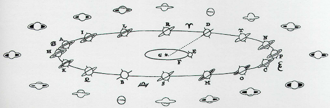
One of Tufte’s theories I’m planning to use is his theory on small multiples. Small multiples allow viewers to compare different data sets side by side, making it easier to identify patterns and trends. By using small multiples, designers can showcase changes over time. Each graphic is similar in design, which creates a visual narrative, allowing the audience to focus on the data and not distracted by anything else.
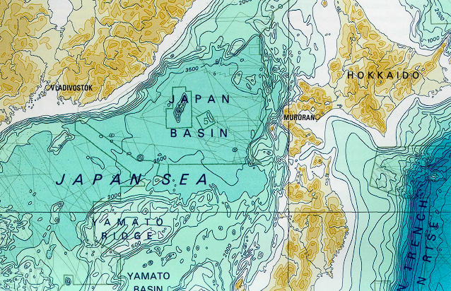
Another of Edward Tufte’s theories I plan to use in my animation is his theory on use of colour. Edward Tufte explains the significance of colour in data visualization, particularly how different colours can represent various data sets. The best examples of this concept can be seen in old map designs and layouts. These maps are filled with a range of colours, hues, and saturations to connote information about the terrain and depth of bodies of water. For example, the darker shades often indicate higher elevations like mountains, while lighter shades represent lower areas. This use of colour helps viewers quickly grasp the landscape’s features without needing much explanation.
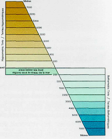
By carefully selecting colours, I can direct the viewer’s attention to important points and enhance their understanding of the information presented in my animation. Using specific hues and shades allows me to create a visual hierarchy, making it easier for the audience to identify key elements and grasp the overall message. For example, brighter colours can highlight crucial data, while tones can serve as background elements, ensuring that the focus remains on what matters most (energy drink). This use of colour not only makes the animation more engaging but also helps convey it more clearly.
Additionally, colour can evoke emotions and set the mood for the animation, further helping how the audience sees the information. By integrating thoughtful colour choices into my work, I aim to create an impactful experience that bonds with the viewers.
References
Tufte, E.R. (1990) Envisioning Information. Cheshire, CT: Graphics Press, p.67.
Tufte, E.R. (1990) Envisioning Information. Cheshire, CT: Graphics Press, p.91.
0 Comments