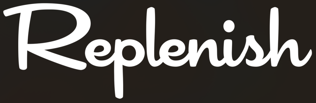
For my first task in this design project, I was tasked with creating a brand name that would fit with a specific audience. The goal was to develop an energy drink targeted toward individuals aged 60 and over. In considering the characteristics of this audience, I focused on the importance of health and natural ingredients. Older adults are often more conscious of their health and well-being, so a brand that conveys a sense of that would be appealing. I settled on the name ‘Replenish.’ This name encapsulates the idea of restoring energy and vitality in a way that feels both inviting and supportive.
Colours
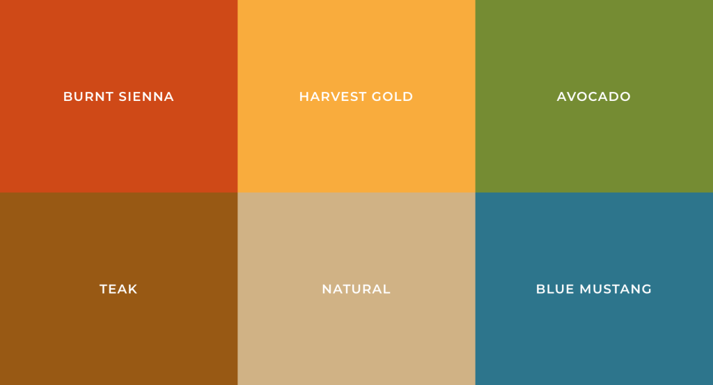
I looked into a range of colours that were popular in the sixties, as well as those that could represent specific flavours effectively. This was crucial in creating a visual identity for the brand that resonates with the target audience. The colours chosen not only reflect the vibrant and bold aesthetics of that era but also evoke feelings associated with the flavours of the energy drink. For example, warm hues like orange and yellow can represent citrus flavours, while cooler tones like blue can evoke a berry taste.
Fonts
Just like the colours I chose, I wanted my fonts to reflect the essence of the sixties as well. The typography plays a significant role in establishing the overall vibe of the brand. By selecting fonts that evoke the playful and bold styles of that era, I can create a stronger connection with the audience. Fonts can evoke emotions and memories, making them an essential part of the design process. By using typography that mirrors the sixties, I aim to capture the nostalgia and energy of that time, appealing to the target audience’s sense of familiarity. Additionally, the right font can enhance readability and brand recognition, ensuring that the message is clear and engaging.
Labels
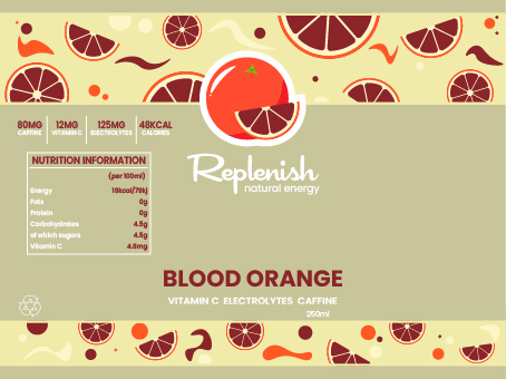
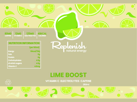
Once I established my brands name, colour pallet and font, I created my two drink can labels for the two different flavours. Blood Orange and Lime Boost. Showing a variety of flavours in my animation will no doubt help the idea I’m trying to convey towards my audience. It will boost the looks onto the brand making it more memorable and perhaps increase popularity.
The metamorphosis conceptual design for my energy drink brand, ‘Replenish,’ will revolt on a unique visual transformation of fruit being an orange turning into the drink can itself. This design will illustrate how the natural essence of the fruit is captured and transformed into the drink advertised. To achieve this goal, I will use the shape of the can’s top to my advantage, and use the roundness of an orange. The circular form from both the objects will serve as a key elements in this transition.
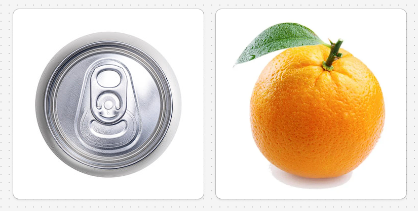
Example of a perfect metamorphosis transition
References
Dumbo Lover (2011) Dumbo Pink Elephants on Parade HD [YouTube]. Available at: https://www.youtube.com/watch?v=jcZUPDMXzJ8 [Accessed 27 February 2025]
0 Comments