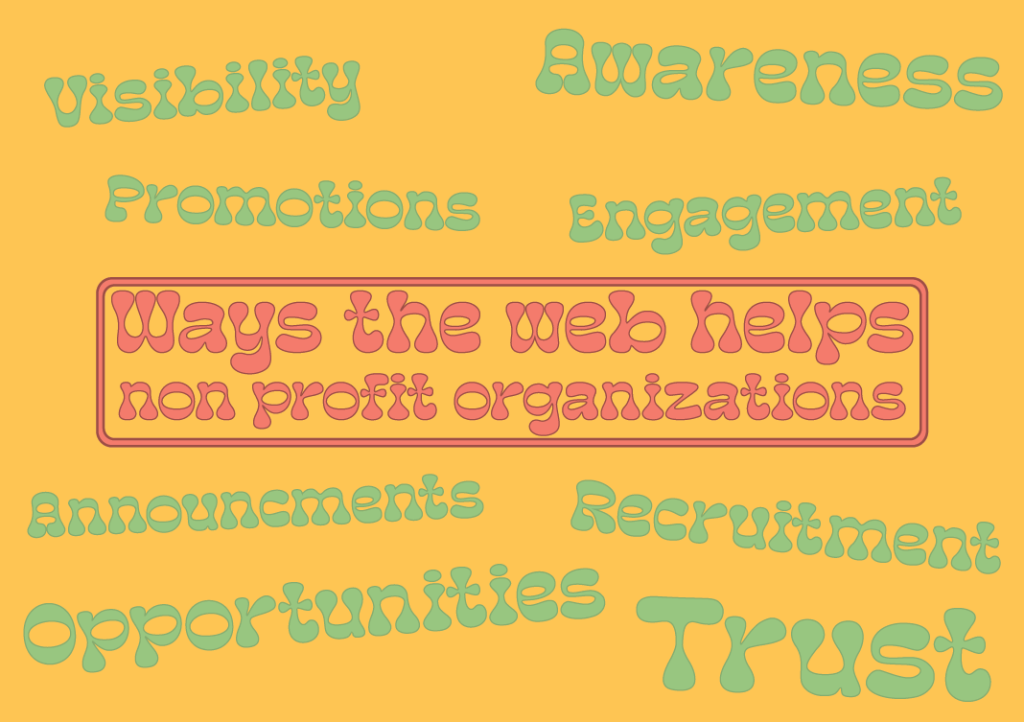
How has the web helped non-profit organizations come up with new ideas and creative ways to solve problems?
Nowadays it is no longer optional for a non-profit organization to not have a website. Because the internet is only going to get bigger from here, having a website is one of the best ways to not only promote the organization but to also build trust with its supporters and the community. Moreover, with the internets vast connections to different audiences, a non-profit organization can connect with users who may not have been aware of its existence otherwise.
Complex missions often require detailed explanations. A non-profit’s mission needs clear communication and understanding. For that problem a website provides the perfect space to explain goals, values, and the impact you aim to make. A well-structured website is perfect to help people easily understand and connect with what your organization does and hopes to achieve.
A website with increased visibility can lead to higher engagement levels. As people can learn about the cause, share it with others and become advocates themselves. Having a website also provides content 24/7 therefor the users can read about it anytime they wanted.
Trust is another key element towards any successful organization. When potential volunteers and donors feel well trusted about the organizations mission, they are more likely to feel confident in contributing their time and resources to the cause. Having a non-profit website makes you credible and trustworthy to visitors.
Promoting events becomes more effective with a website. You can create certain event pages, provide specific details, and even sell tickets or accept registrations online. This streamlines event management and maximizes participation.
Collaborating in web design
During this module there has been several group work activities to really help each of us understand the power and creativity when working together. We are able to come as one and share each of ours strengths and weaknesses within the graphic design course.
It also helps us get to know each other.
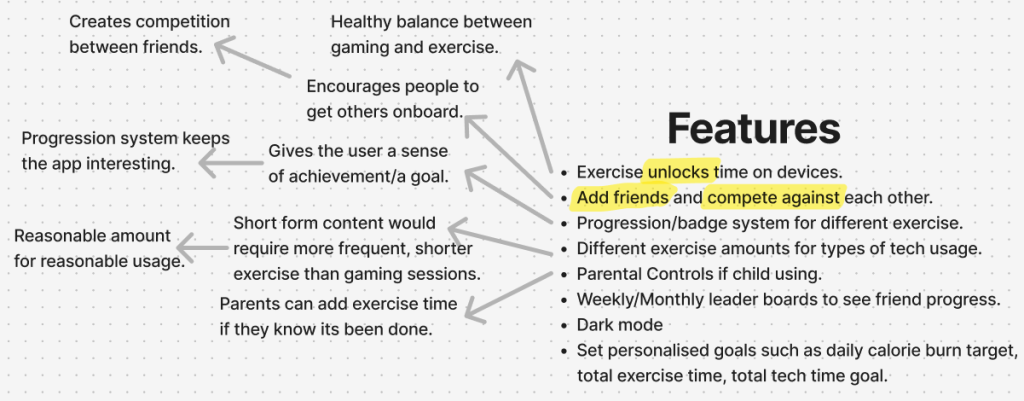
For our first group activity this module I worked with Noah, Curtis and Josh. The task was to create a website or an app aimed towards teenagers to promote fitness combined with gaming. Me and my team decided to go down the path of app development as we believed it would be more efficient to attract teenagers, since opening an app is much easier then to search up a website. And the younger generation now tend to be on their phones quite a lot.
Because this was the first group task in a while I dont really think we had a team captain as such, we had a speaker at the end who told the rest of the class our ideas and designs, but during the task we all just arranged ourself to do our own things which we were best at doing. We did speak as a group at the start as we came up with the initial idea, and everything it could do. But once we had that we slightly went our own ways, but not too drastically. Even though communication could have probably been better we did end up going into the spare room to have a chat about what we had each designed and sourced. And after that we did come out with a final design, so I guess it wasnt too bad.
So what exactly did I do?
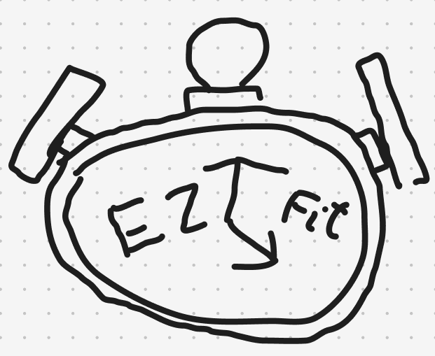
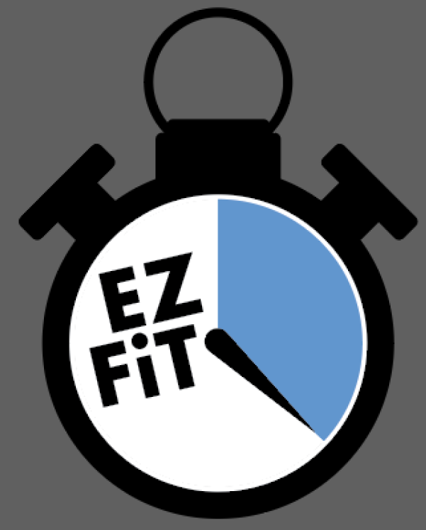
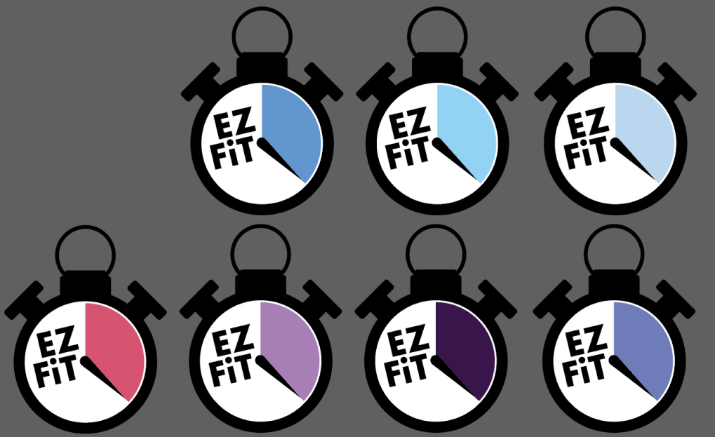
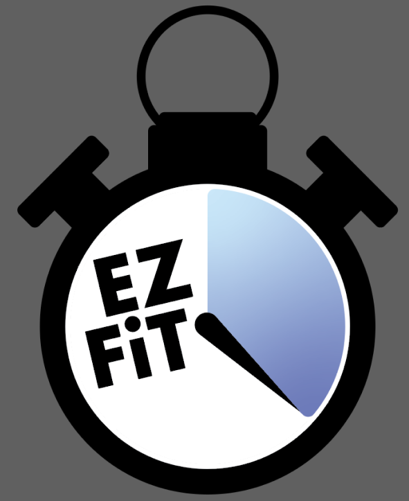
The design behind the logo was a stopwatch, as our app would mainly be used to record the users time exercising and the amount of time they have to go on a game. Noah originally drew the logo only using a mouse and keyboard, I then took the role of creating it using Adobe Illustrator. We wanted to have the apps name (EZ FiT) presented on the logo however we weren’t sure how. In the drawn design, Noah added the name to either side of the stopwatch hand, personally I wasnt a fan of that design so during the time I spent to make it I slightly tweaked it, in the end the I believe group loved it.
Then what did we do?
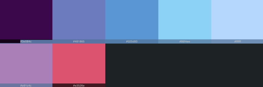
As I mentioned earlier during this task we took ourselves into the spare room to have a chat. During that time I was given a variety of feedback to add and remove certain things to the logo. Nothing major, just some slight changes. Curtis sourced a variety of colours that could be used to replace the blue section and kindly arranged them into a pallet. These were just other possible colours we could use not only the logo but the entire house style of the app.
Finally?
After all the feedback I was given I was able to create the finalised logo design. However, even though I was given many more colours to work with and add to my design, none of them just quite sat with me. Until I had the idea to create a gradient. Originally using both purples it was too dark. But using the blues seems just right.
Analysis of current web design approaches
When creating a website or any other form of digital media, it is crucial to consider the user’s needs. Examples of this could consist of making sure the website is responsive/ usable to any form of device such as computer, phone, tablet etc. However the users needs isnt all about the responsive layout and size, you must also take into account of the sites colours and font types. If the font is too hard to read it is likely the user will loose interest in the site and exit it completely, same with colours not matching. Yet depending on what the non-profit organisation is about should determine the sites colours and fonts.
Grid system
A grid system is a popular technique used in the field of graphic design. It helps designers organize their work and structure specific content. Especially during the construction of websites, grids are likely used to position key elements like text, buttons, images, videos etc. A main purpose for a grid system is to keep all the elements in a consistent flow of placement and make help create the website visually appealing for its users.
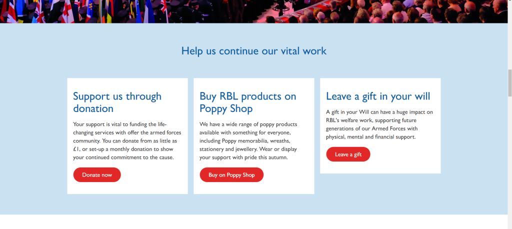
I have chosen the ‘Royal British Legion’ (RBL) as a good example of taking care of placement. A non-profit organisations main goal is possibly to receive donations. Therefor it is their responsibility to create a clear call to action section for the users to see as soon as they enter the website. Otherwise as bad as this may sound users may end up leaving the website if it is just to complicated to make donations.
Throughout this website all the elements are well-aligned and central in each individual section as you explore the page. The main message is clearly displayed on the left with an important call to action positioned to its right, all at the very top of the homepage so its the first thing the user shall see. Another good design is adding an additional call to action button in the top right of the navigation bar right next to the search bar. That button will most likely always be located there so the user doesnt have to return to a certain page just to donate.
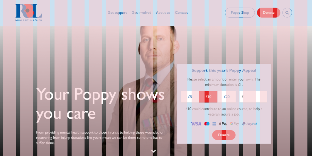
As you scroll down the Royal British Legion website they continue to make great use of placement between each section. Gutters are a technique used to clearly separate sections to show the user they are about to read something new or something different.
Responsive designs
Responsive design is technique used within web development that allows the website to be viewed in different device sizes. Depending on quality and effort put into websites, design elements included in the site can change as the site shrinks and grows to different proportions.
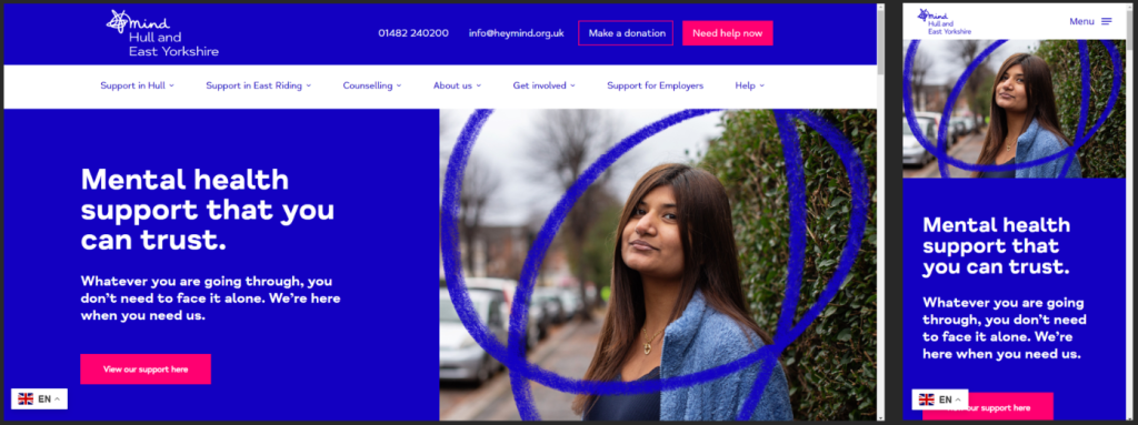
For example I have chosen the ‘mind Hull and East Yorkshire’ site as a good representation of responsive layout and design. As seen, once the website is shrunk to phone proportion the navigation menu changes from a long bar to a small burger drop down menu. The copy of text and image is also moved to a presentable position to be sure its readable when viewed on a mobile device.
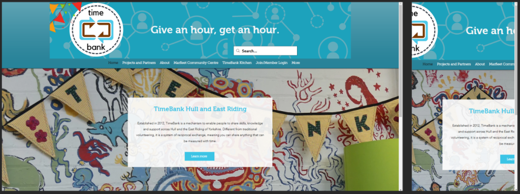
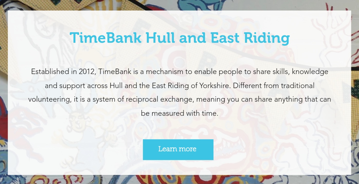
However, not every website consists of having a responsive layout. For example the ‘TimeBank Hull and East Riding’ website does not include any format of responsive layout. At first when its in pc/ computer proportions the website seems fine. Once its shrunk to mobile device none of the elements change size or even move. Resulting in the site simply not being readable.
Accessibility
Accessibility refers to the practice of creating visual content that can be easily understood and interactive with people who suffer from diverse abilities and disabilities. This consists of colour contrast, font size, use of images, caption etc. One major key point of accessibility is ensuring that the text present on the site is legible for individuals with sight problems.
REFERENCES
Royal British Legion (2024) Homepage. https://www.britishlegion.org.uk/ [Accessed 7 Nov 2024].
Hull & East Yorkshire Mind (2024) Homepage. https://www.heymind.org.uk/ [Accessed 7 Nov 2024].
TimeBank Hull and East Riding (2024) Homepage. https://www.timebankhullandeastriding.co.uk/ [Accessed 7 Nov 2024].
Digital Marketing using web technologies
Digital marketing is the practice of utilizing digital platforms to promote a brand and perhaps engage customers. It includes creating and sharing content across a variety of digital media channels such as websites, social media platforms, and even emails. Any style of marketing can help organizations thrive. However, digital marketing has become increasingly important because of how accessible digital channels are now.
What is email Marketing?
Email marketing involves sending specific emails to the organizations followers inboxes to inform them of new products or services, boost brand awareness etc. Email marketing is well known to engage and inform its users. It helps keep the audience informed and interested in your organization, and ensures them to stay up to date, as websites will always be changing depending on the organization.
Social media
Some of the popular social media platforms like TikTok, Instagram, Facebook, X, Snapchat, even YouTube are suitable sites to advertise non-profit organizations. These social apps end up capturing new generations of audience as they grow up with it. Some of the older users may use these platforms to interact and keep notified, but its perhaps a small portion of users as they have only found out about it due to younger users showing or telling them about it. All of these platforms include hashtags within their posts. Nowadays hashtags are incredibly key, as if the user is interested in the post they can simply click on the hashtag related to the topic and it will take them to a page dedicated to that genre.
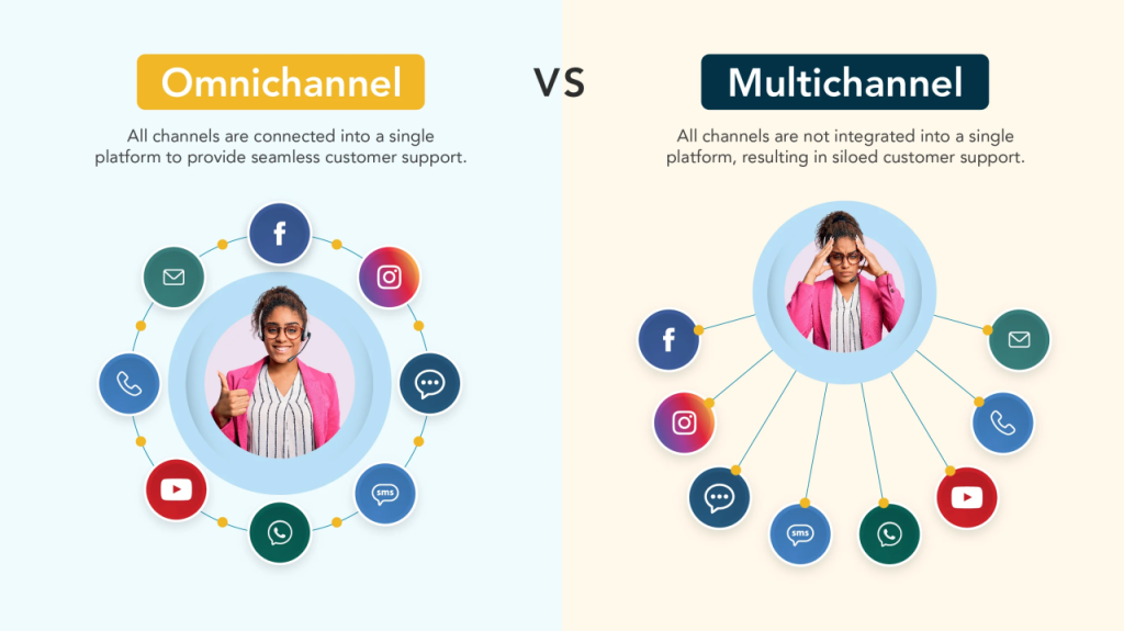
Multi-channel & Omni-channel marketing
Multi-channel marketing refers to the practice of interacting with the users using a variety on indirect and direct communication channels. Whilst omni-channel marketing refers to the users approach that intergrate all channels such as apps. It ensures users can easily interact with the organization across different platforms, improving their experience.
Proposal Post
After looking through a variety of pre-existing non-profit organizations I have chose to focus on the World Wide Fund for Nature otherwise known as the (WWF). The World Wide Fund for Nature (WWF) was is an international non-governmental organization founded in 1961. When the organization was first created in 1961 WWF stood for World Wildlife Fund, in 1986 it was later changed to World Wide Fund for Nature. However till this day people still call it by its original name.
WWF’s primary mission is to reduce threats to life on Earth. This includes protecting endangered species, preserving natural habitats and promoting ways to cause less harm towards the environment. WWF employs a variety of strategies to fulfill goals. This could be scientific research, community interaction and policy advocacy. The organization tends to focuse on several key areas, Wildlife, climate change, oceans, forests, freshwater and food. Furthermore, WWF also focuses on raising awareness about the environment through education programs. They provide resources and key information to help people and other organzations understand the true importance of nature and how to protect it.
Initial design ideas and inspiration sources
The logo of the World Wide Fund for Nature features a stylized black and white image of a giant panda. Kind of in a stencil format. The choice of the panda is significant as it represents endangered species. The design is simple yet incredibly effective, the bold black shapes around the white ensure high visibility and easy recognition. This technique resembles the pandas features such as its distinct patches around its eyes. As probably noticed the colour pallet for this logo is extremely simple (black and white). Eventhough is simple it conveys a strong message. The black represents strength regarding environment issues, while the white background ensures visibility.
After I gave the website a slight review it is clear that there is perhaps some changes I would make. Not many and not drastic ones either. But once entering the website on a tablet device especially you are met with clear amount of to much white space. Having the right amount of whitspace can give the page a confident and professional look to it. Whilst too much whitespace can make the sote seem extremely empty.
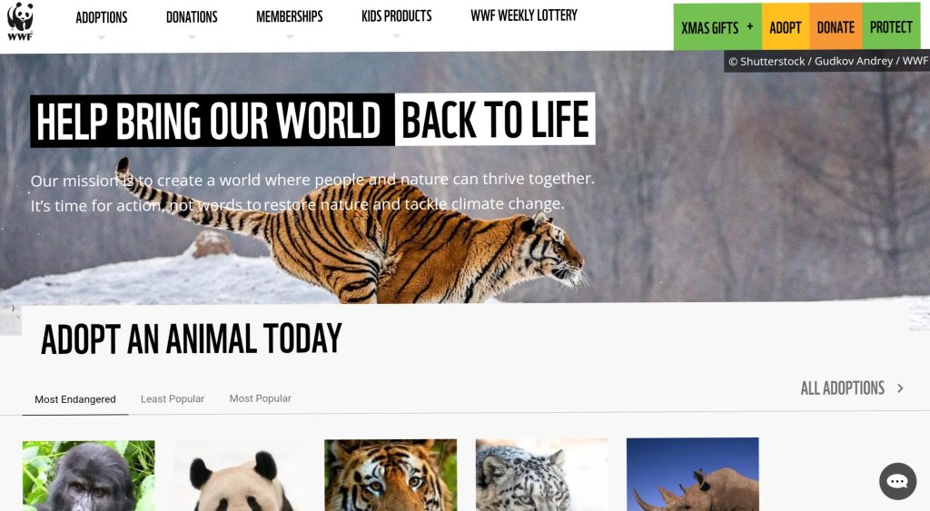
As seen there is too much white. I would alter the arrangement of the main image and main message displayed at the top. Not use an image that that would stretch across the entire screen, just to what looks to be cut off halfway through. The thin white text is also not in a suitable position as some users may find it hard to read, not only due to its thickness but also its similar colour to the image its placed over.
I understand due to the lack of colours in the WWF logo, it was probably hard to not include so much white. However, I would use the images to my advantage, I would sample colours from the specific images used in each topic and colour the text similar orncontrast to them. Hopefully that would add more life into the pages.
The typography used in this website is mostly decent, but that the same with any thing with black text on a white background. Thankfully, the font used in the logo isn’t present in the web. It may end up being too cluttered with large unnecessary text. Will also effect some users readability if it isn’t sometimes left as sleek sans serif fonts.
Target audience analysis
WWF’s target audience is aimed towards people aged 18-60. These tend to be people who are concerned about the environment issues within the future. This audience is well engaged within social media and other digital platforms, making WWF ideal for online campaigns and sessions. Additionally, WWF seeks to reach out to families, particularly parents who are interested in educating their children about nature.
Objectives for the multi-channel marketing strategy
The multi-channel marketing strategy for WWF focuses on engaging the audience to raise awareness about environmental issues. This strategy is various platforms and methods for max effectiveness.
Social media
WWF utilises its website and social media platforms like Facebook, X, Instagram to share compelling stories, images and videos about wildlife. These channels are crucial for reaching younger audiences.
Content marketing
The organization produces a wealth of content, including blog posts, articles and decuments etc. This is some of the few ways WWF educate their audience and also the public about environmental challeneges.
Email campaigns
WWF employs targeted email marketing to keep supporters informed about campaigns and even events. These are what we call newsletters, they highlight popular stories and updates to keep the users engaged.
WWF effectivley raises awarness, engages supporters and drives towards wildlife and environmental protection, making sure we have a sustainable future for our planet.
Key features and functionalities
A non-profit organization primary feature is to have a functional donation call to action button. This allows the user get straight to the point as soon as they enter the website. The main call to action (CTA) button should be displayed along side with a short brief/explanation about the organizations mission. This site does include a CTA however I don’t think it’s in the best location. I also believe it could do to be bigger. Not only would this help with some users accessibility but it allows them to understand this site credibility more.
In conclusion WWF continues to inspire new individuals to understand the true meaning to why we should protect our planet and the creatures that live on it.
REFRENCES
World Wide Fund for Nature (2024) Homepage. https://support.wwf.org.uk/ [Accessed 9 Nov 2024].
0 Comments