Defining The UX For My Festival
Festival Rundown
MCM Comic Con London is a fan convention/ festival held at Excel London twice every year, usually on the last weekend in May and October. The festival focuses on comic books, video games, sci-fi, anime, cosplay and any other pop culture media. Throughout the weekend a variety of guests from popular media are also invited to the show. This gives them the opportunity to promote their latest product or production such as movies, TV shows or print based comic books. However, it could be to raise money and funds for a charity. It is common to see television and film guests selling autographs and interacting with their fans both in person at a booth/ panel or on stage during a Q&A sessions (questions and answers).
Usability Goals
The key focus is navigation when it comes to my Usability goals with the website design. The website shall have an easy and understandable navigation bar to take them to specific pages such as the about page, ticket page, a things to do section and even an area to sign in or create an account. It doesnt have to be massive to stand out, just placed in a certain area for my audience to find with ease. Most navigation bars are placed at the top of the website, either centred or going of to one of the sides (preferably the right hand side as the logo tends to be on the left).
Problem Space
MCM Comic Con has multiple things to consider when looking at the problem space. Examples of these problems consist of: the organisation of the festival, plenty of space in each room used throughout the week, ticket selling, variety of food and drink stations, providing enough toilet facilities, nearby parking and hotels and of course security/ staff. However, all these problems can and will be controlled.
Requirements Gathering And Analysis
The target audience for MCM Comic Con typically attracts a wide range of visitors, including fans of comics, movies, television shows, and video games. Many of the visitors tend to be young adults, in the age range of 15 to 35, but there are also many older adults who attend to accompany the children. Some of these fans may have never attended a comic con before and may not have a clue what goes on if they dont do their research. But a majority who show up have attended before and know what happens where at what specific times.
User Needs
The priority for the users needs will most likely go towards food and drink stations as the staff working on them need customers to buy from them.
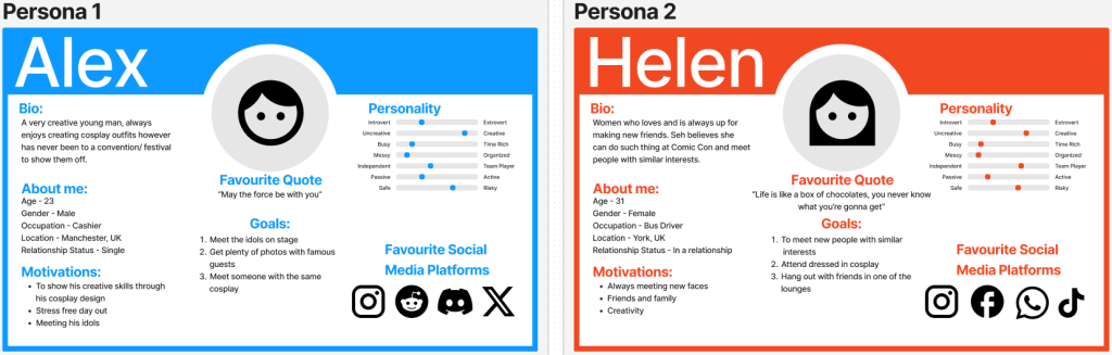
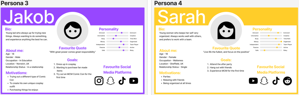
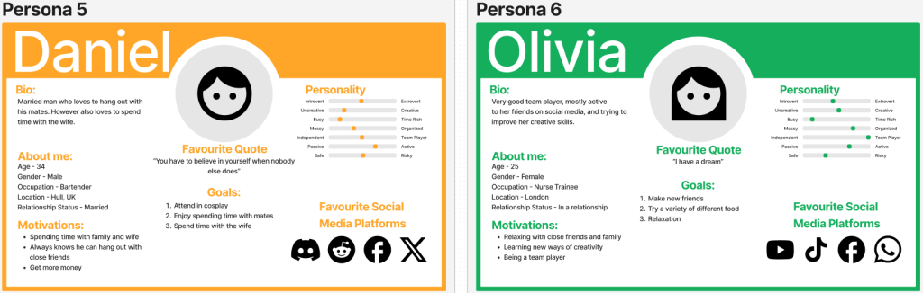
To source secondary feedback I created posts on Reddit for users to answer, if wanted to, about their experience at MCM Comic Con or what they want to do if they have never been before. This feedback gave me a chance to construct 6 personas. These personas feedback allows the design of the festival/ website/ app to all be created correctly to meet the users needs and wants.
Accessibility Concern
An accessibility concern anything that makes it difficult or impossible for a user with a disability to equally access, navigate, or engage with the content on my website. Some of these concerns could consist of:
– Colour blindness
– Learning Disabilities
– Speech
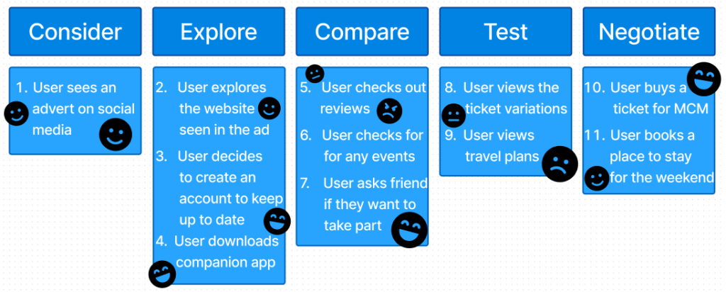
My user journey map is the key steps representing what and how the user would react to seeing an advert for my festival up to purchasing tickets for it. A user journey map is a visual representation of the steps and interactions a user shall go through when using some sort of system. These maps can also present the users feelings, such as frustration or confusion, happiness, at any of the steps the user is needing to take. I showed these emotions using Figma emoji icons.
Success With My Design
An example of success for my design work shall result in having website and companion app always up to date with the latest news on the festival. Whether that being out of tickets, or just “a heads up section” to find out if theres been any changes to the day. The website and app will also be very easy to understand and easy to navigate round.
Assumptions For My Festival
The major assumption is making sure all the guests arrive on time and in the right place. Otherwise, they would have to be escorted by security through some of the main halls. An issue with that is I would assume nothing would go wrong during that escort. An example of an issue could be: Too many fans crowded small areas, this is an issue as it result in an accident.
Similar Festival to MCM
MCM London’s main competitor is most likely London Film And Comic Con (www.londonfilmandcomiccon.com) The event is going to be taking place Friday 5th July to Sunday 7th July 2024 and has around 100,000 attendees over the three days.
UI Principles To Be Applied To My Design
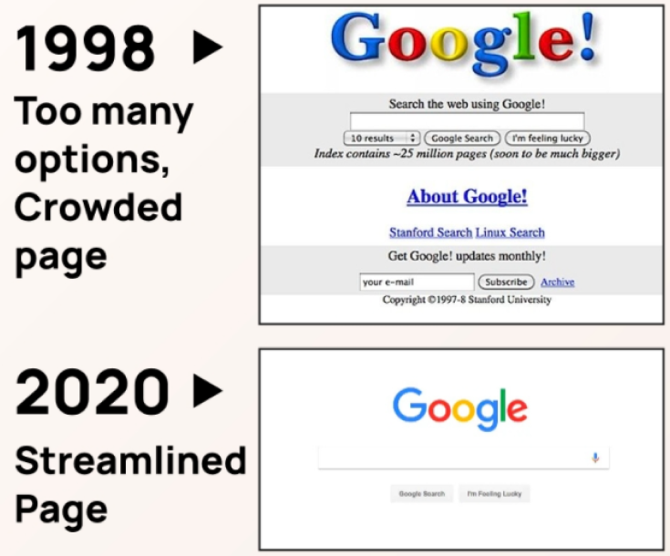
To guarantee clear regularity through MCM Comic Cons new website and app design laws shall be taken into account to give out the best user experience. Examples of these laws consist of: Making sure the font is spaced clearly and easy to read, ensuring the website is easy to navigate around, using a correct colour palette/house style (preferably MCM’s original one) and lastly not over crowding a page with too much information or images.
Out of all these key laws the most crucial one is not overcrowding with information. This law relates to Hick’s law, were if there is too much copy/ images/ buttons it could result in the viewer leaving the website, as it gives them too many options to decide where they want to go or what they want to see.
Supplying feedback shall be taken on account. Everything such as buttons, images, videos etc shall be properly shown and possibly animate in a way. This will make the viewers aware that what they have clicked on is actually responding. Examples of this can include: Highlighting text/ fields when inputting user data if they be making an account or signing in to purchase tickets (turning it red if certain data is still required), loading wheel icons, maybe a digital countdown placed somewhere on homepage/ ticket page counting down until the tickets can start being purchased, or even a que for tickets which is were the loading icon could then come in.
When creating the IxD (interaction design) call to actions should be applied to help and guide the user into making the right choices when browsing the website. All these actions should allow the user to easily browse their way through the website from one page to the other and be sure it takes them to where they want to be.
Rejected Designs
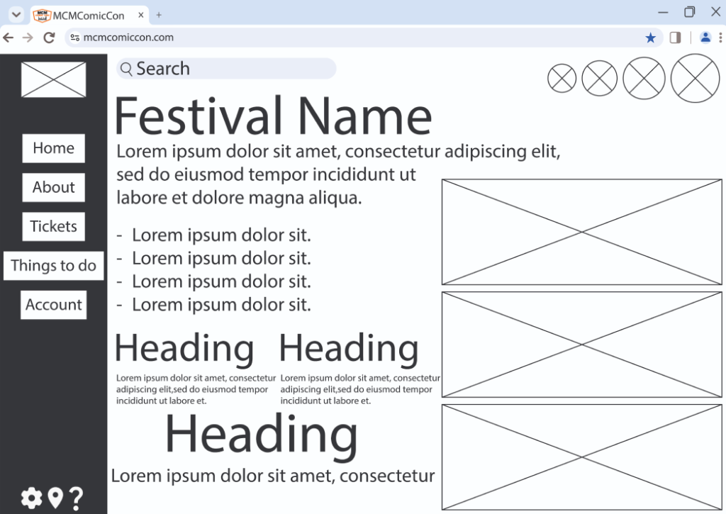
This is the very first attempt to designing a website home page for my MCM Comic Con festival. Its created in a form called a wireframe/ page schematic. And the reason it doesnt look appealing to view is because wireframes typically do not include any styling, copy, colour, or graphics. Even though this page includes a variety of information a lot of it wont be needed as soon as the user opens the site. Another issue could be the font, obviously this isnt going to be the font I will use as its still in early development but they variety of sizes used confuses the user. They may not end up reading the small text as it may not seem as important (or they cant). Hence this design being seen as a reject design.
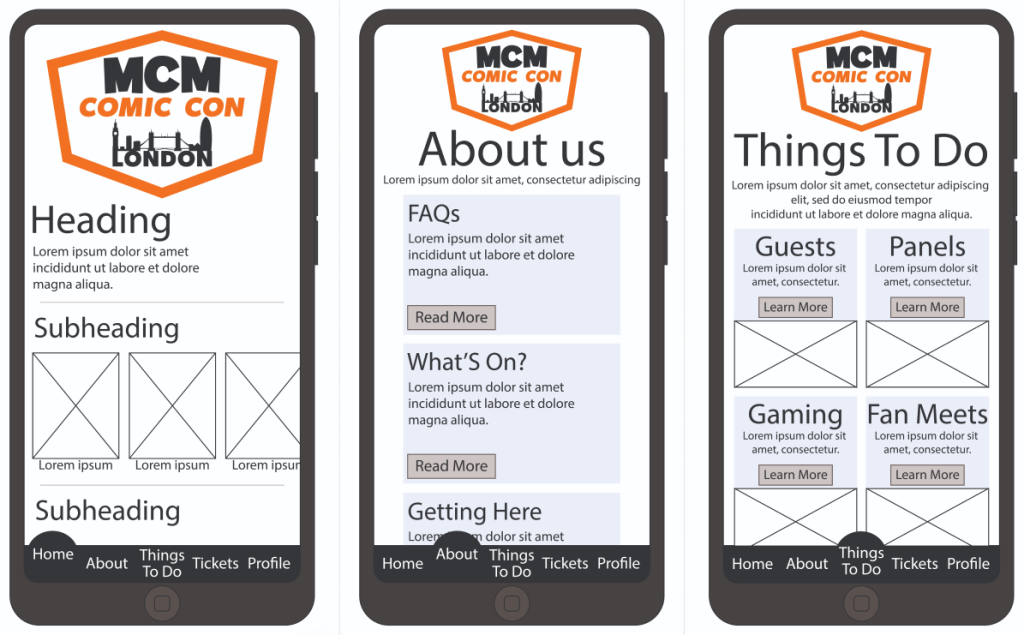
Low Fidelity UI Prototype
Website Wireframe
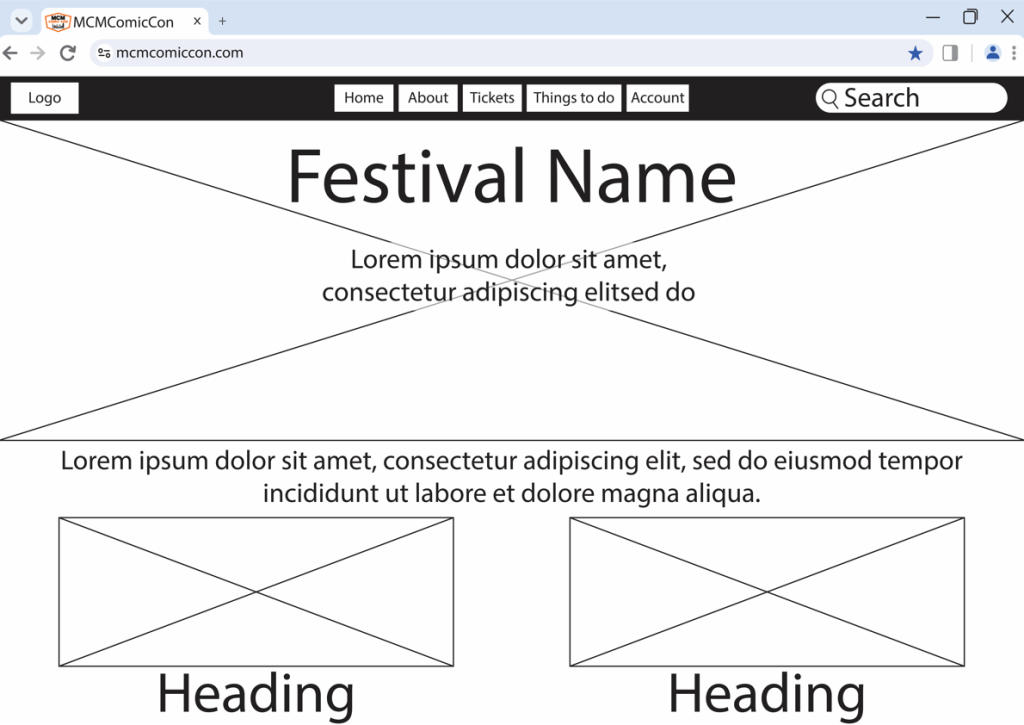
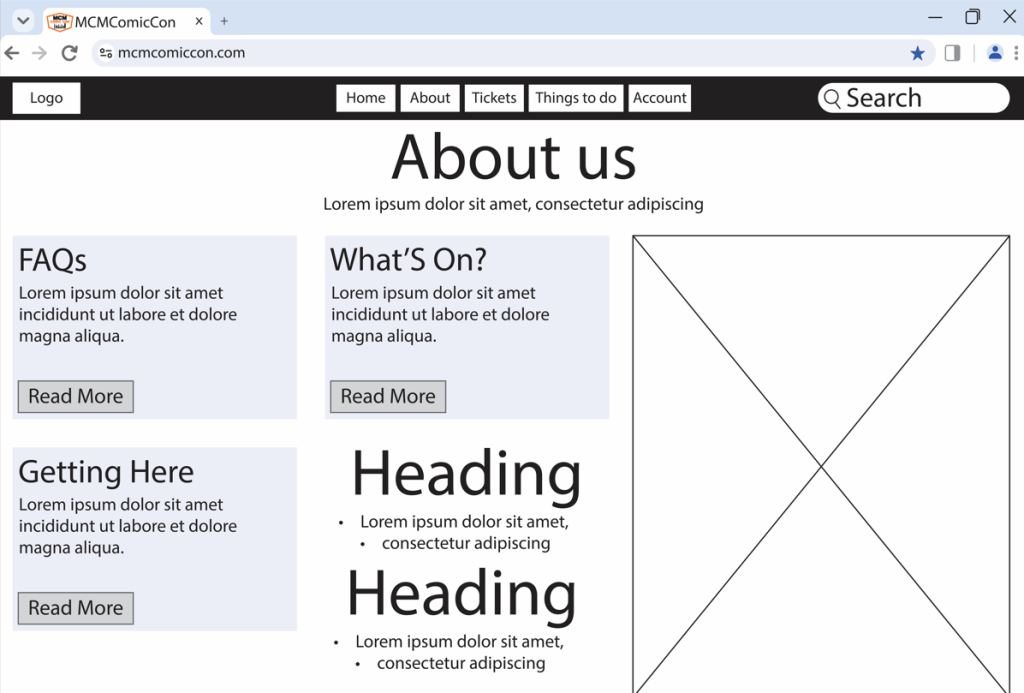
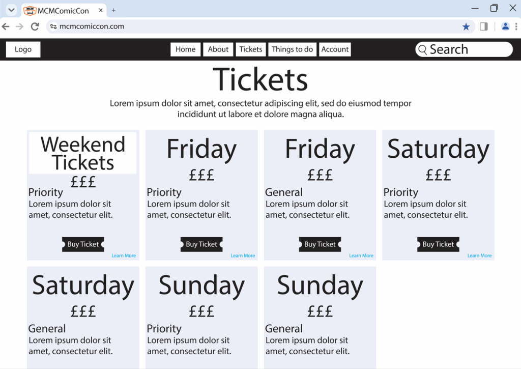
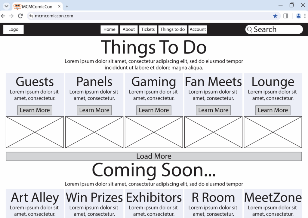
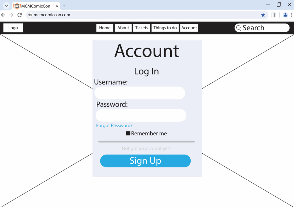
Because I created a rejected/ rough design, the prototype creating was completed quite quickly. As the prototype is created as a wireframe it still lacks the house style colours, the logo in the top left, images etc. However, when creating a high fidelity design the colours shall all match the original website, as its still based of MCM Comic Con.
As it is still a prototype it is still in early development, so it can and most likely will be changed before the final design. But stakeholders and customers are still able to understand where everything is located or going to be. Because the navigation bar isnt overloaded with different types of pages, its very easy to work around it. Find out what they need specifically. But one other key element is the search bar. So in case they cannot find the information they are looking for, they can search deeper and hopefully find the answer they were looking for.
Companion App Wireframe
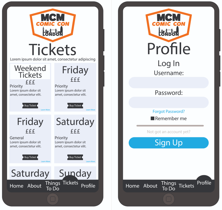
The MCM Comic Con companion app removes the complexities from the variety information that is included on the website. Because it is just an app it shall not include as much in depth detail compared to what a website would. It still provides important key details such as ticket purchasing, things to do, about us and an account page. It just lacks information were if you have to get in touch, its best done online on the website other than a mobile device. But because its an app, and its includes less information to run better, that gives the designer a chance to make it more interactive/ appealing to use. Which is why when I created the navigation bar at the bottom, I made out that which ever page you go onto this circle pops out as the text also rises up. But the app it self shall also have boxes that expand on click providing information, more little videos etc.
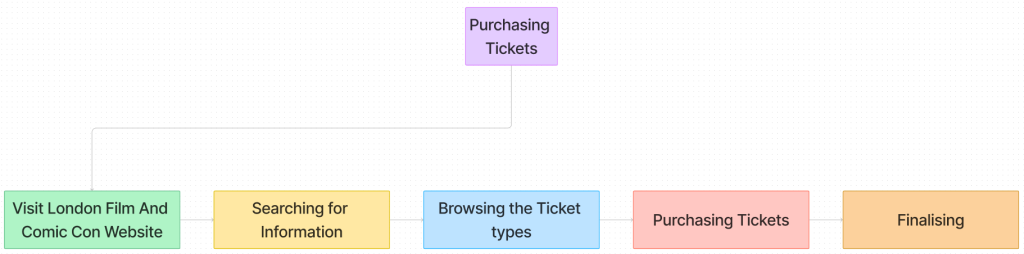
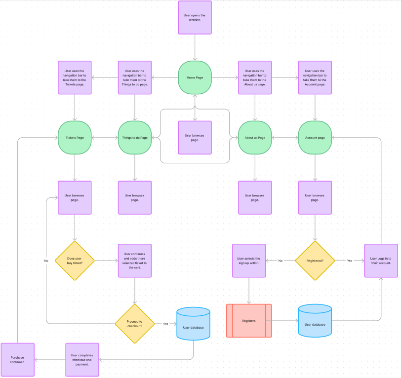
Simplified HTA For Website
In Depth HTA For Website
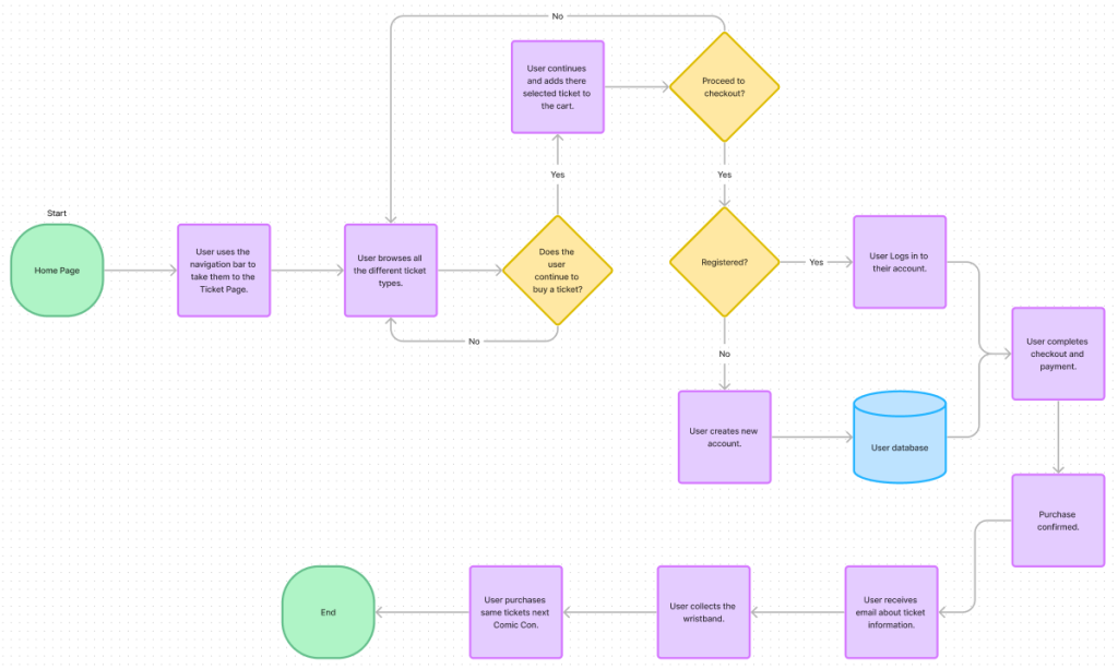
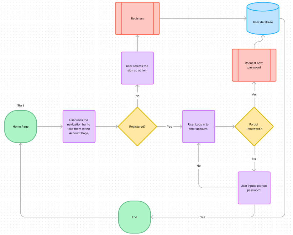
The top HTA is a simplified version of how the website shall flow, how everything is linked to each other as the navigation bar is always at the top therefore always accessible for the users to change page from anywhere on the website they are not having to go back to the home page every single time. This is so the stakeholders can view how it works and just how simple it will be. However, the last two HTA’s are a more in depth detail to how it will flow if the users want to purchase a ticket or log in/ sign up.
0 Comments