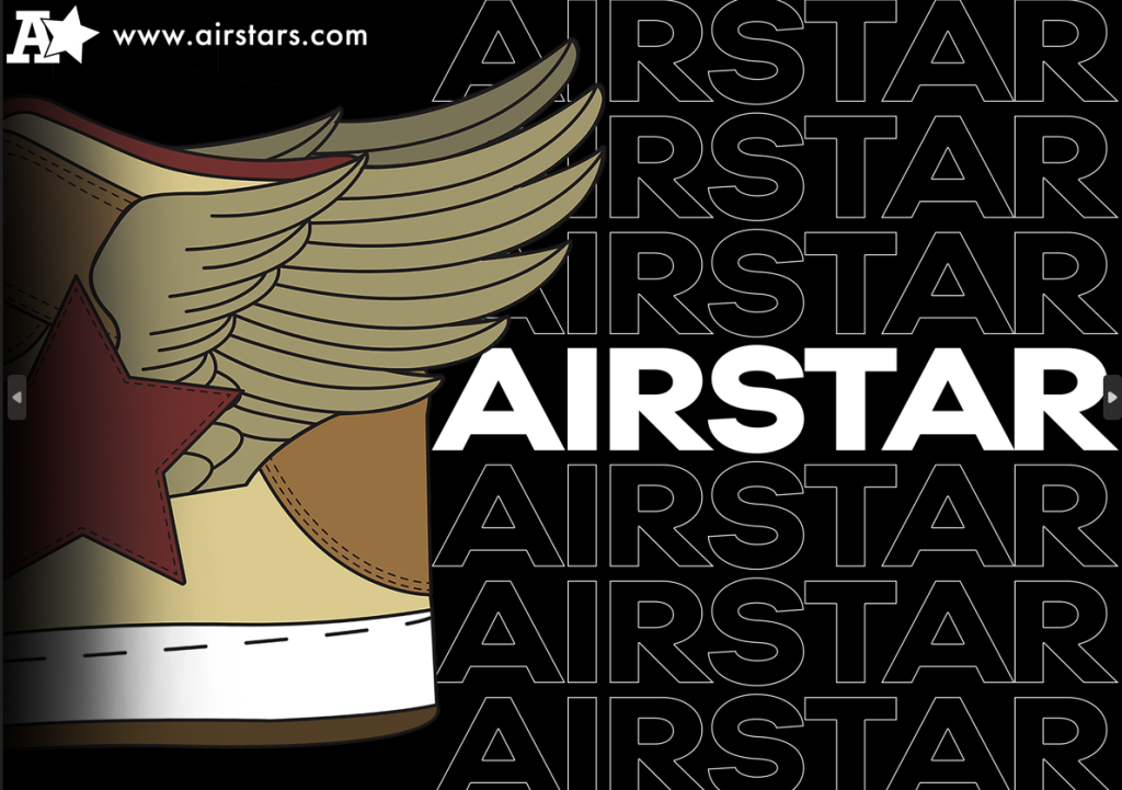
Design 1:
For my first design I wanted to create a poster that could be seen on a billboard. In doing so I couldn’t include too much information as that could distract the driver for too long. But id have to include the right kind of information that appeals to them. This consist of the shoe, the brand name, a logo and a website. This design was created on Photoshop as I wanted to see if there was going to be much difference in looks via the end ( there isn’t). But I started of with the main image. Now because this shoe has a particular memorable patter right in the middle that extends out the back (star with wing) I thought that I wouldn’t have to include the front of it. I felt like there was no need. Beside that gave me space to work with on the right hand side to include the written copy. Because its a billboard advert the writing obviously had to be big enough to be seen. So originally I wrote the name nice and bold added a logo, added a website, and its looked dull. There was nothing to add enough interest at the top or bottom of the right hand side. So instead that lead to the name being repeated from top to bottom on the right, shoe on the left and the logo and website out the way but still visible enough in the top left.
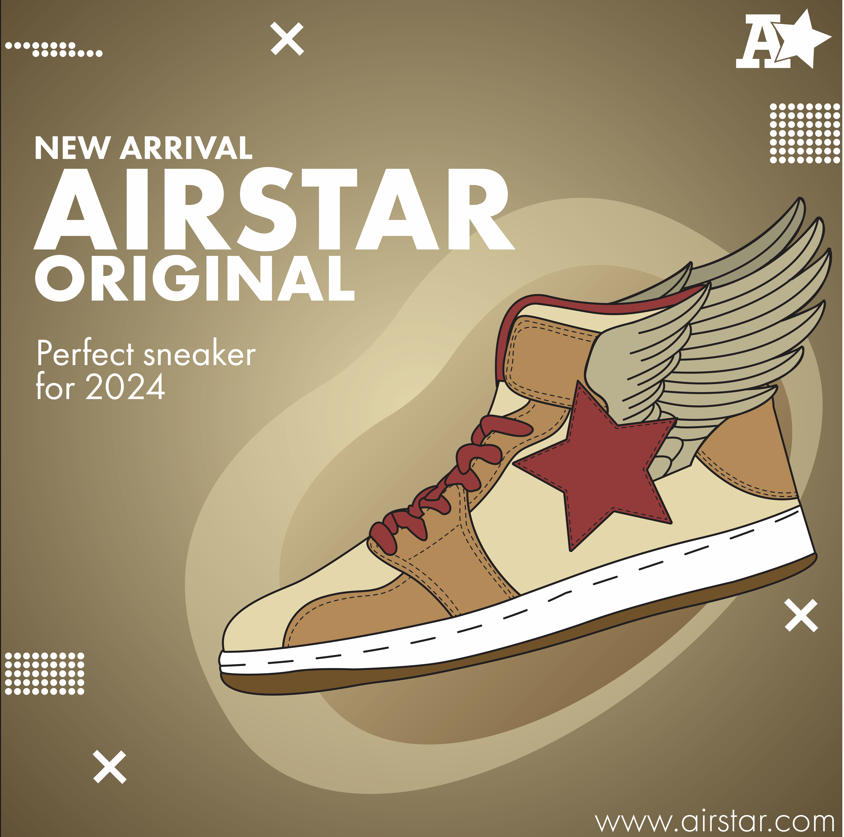
Design 2:
For my second advert I wanted to create a social media post. This shall really attract my target audience as they are the generation of constantly using mobile devices. But for this design the far background was created using a simple gradient, white in the centre getting darker as it goes out. A simple bean like shape to act as some sort of support for the main image. And simple white copy in the Futura font of the side. I created some simple graphic shapes to place around the side just to simply lighten up the post. Also included the website in the bottom even though that would be mention in the caption for the post.
Logo was added in top right corner for the audience to recognise it.
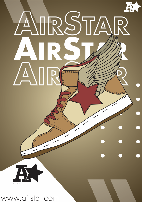
Design 3:
For my final design I created a simple A4 poster advert that includes another gradient taken from the previous design. More little graphic elements to make it bring interest. The masthead that is slightly covered by the main image, however that isn’t an issue as I repeated it above and below it. However even if they weren’t there hopefully the logo and website would help the audience recognise that its and Air Star advert.
0 Comments