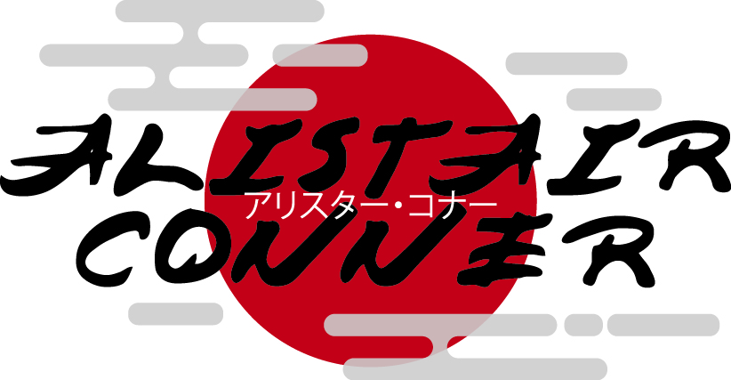
Design Idea 1
For my first typographical name logo I wanted to relate it to a style of art that I find quite interesting. I picked the style of Japanese art, as I particularly like how the letters look with the strokes of the brush. So for my name I used a font specifically called Japanese Brush. I modified how it look as the letters seemed too far away from each other. I did this by giving the text outlines, ungrouping each individual letter and adjusting the kerning of them until I was happy with the result.

Even though I was a fan of how my name looked it still felt empty. So I created a darkish red sun to resemble the Japanese flag and some clouds I created with the rectangle tool and modified corners to curve them. However, the clouds kept drawing the attention away from the main purpose so I gave them a slight opacity. Now I look at it that kind of gives them a slight cloudy texture which is great. For extra detail I included my name in Japanese in the centre of the dominant text.
Design Idea 2:
Unlike my first design for this idea I wanted to keep the logo as modern and sleek as possible. I tried to use one of the most modern looking font I could so I landed on Futura. I modified the kerning again to give it an appealing look, and more up to date. The colour was left black as that helps give the logo a much more serious/ professional look to it. And because my first name and surname end with the letter ‘R’ thats what gave me the idea to try make this logo more memorable. By increasing its size drastically it gave the sense of it looking like a drop cap, but just not at the start.

0 Comments