Design Idea 1:
For my first promotional poster I wanted to promote my passion for graphic design. I started this poster with my name at the top of the page. However, I wasn’t happy with any of the typefaces I had chosen. Because I’m trying to promote my passion I ended up creating my own out of the shape and pen tool. I coloured each letter differently to help my name pop out towards the viewer but I kept the pallet small with only four colours, as too many colours could have ruined the poster.
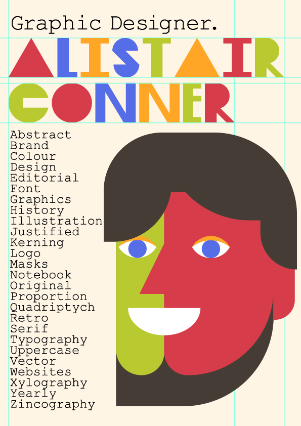
I then created a self portrait of me made inside Illustrator. As I had all individual shapes created I still had to decide what colours each part of me is going to be. I could have simply sourced colours from a photo of my face using the eyedropper tool, however I wanted this poster to look creative. And because I didnt want too many colours on one poster I used the four from the name I made. This shows that even though the colours in your portraits dont match you, they can still look good when they are not. Still, I made my hair and beard brown because I wasn’t happy with the others. The words down the side of my portrait are meant to connote words that I am familiar and understand from the genre graphic design. To make my poster more interesting I wrote them in a A-Z form.
To give the background more interest I created fake guild lines to sit around my name as if the poster is still in Illustrator being made.
Design Idea 2:
For my second promo poster I wanted to show that I wasnt self taught and that I fully understand the programs I am going to be working with in the future. I did this by creating a poster promoting that I’m a student for Hull University. I started this design off with a portrait of me turned black and white using Photoshop. Brought back into Illustrator I started to create the poster. I wanted it to be a geometrical as possible. So using rectangles as patterns/text boxes worked because even though one of them obstructs the main image I gave it a slight opacity just to keep the image still visible.
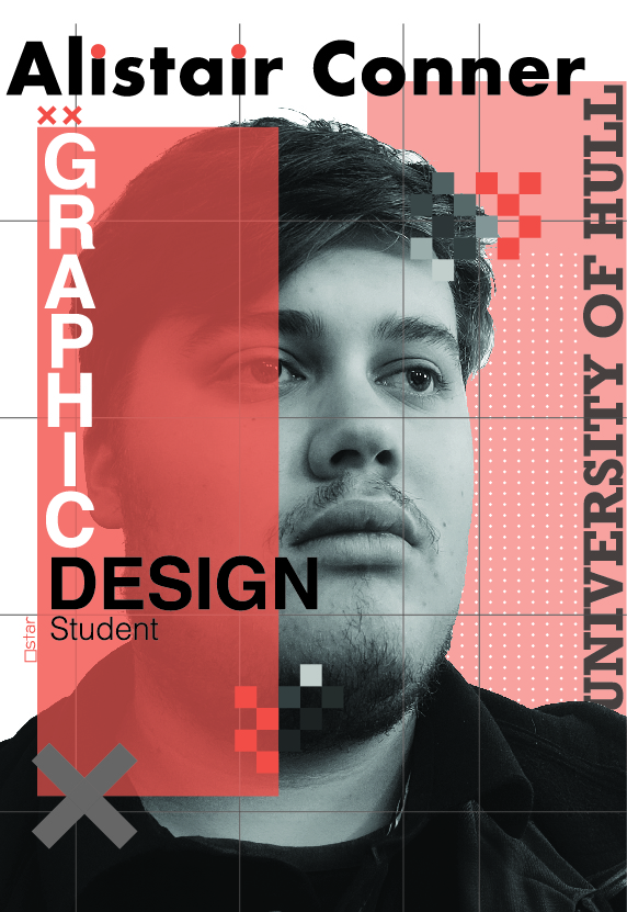
I modified my name with not only the spacing but the dot on the I’s to make it more appealing. Mentioned that I was a student for graphic design and where.
0 Comments