Design Idea 1:
For my first conceptual logo I wanted to produce something that represents creativity. With this particular design I was wanting to create a logo that represents my own creativity (my own original work). So I started the design with a simple pencil created with the shape tool, then made out that the pencil was writing my name. However, I didn’t see that design showing much conceptual aspect to it. And to be honest I couldn’t see much of a logo, as there was too much going on in the image.

The other way I presented this logo was by adding a brand name onto the pencil. The brand name being my name can show that what ever this pencil (my pencil) draws will be my own original artwork. This design not only shows more conceptual features to it, but it looks more like a logo due to the fact it is much more simplified.

Design Idea 2:
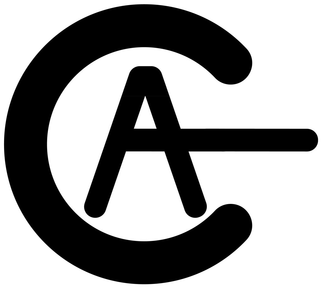
For my second conceptual design I really wanted to create a logo based of something I enjoy doing. And in my spare time I enjoy playing video games. I also wanted to create this logo including my initials. Now because I prefer simplistic logos over complicated ones, I thought that my initials (A.C) would be perfect to attempt to re-create a power button.
I used the C as the outer circle as that is pretty much identical for the ‘off shape’. However, I needed a way to use the A to create the ‘on line’. With experimenting the A’s placement I decided to place it in the centre of the C. In doing so I extended the A’s bar out towards the right until I was extended far enough to look like the line.

0 Comments