Context
Conceptual design creates a strategy to transform a concept or idea into visual media. It’s the underpinning of a successful design process, and no project can start without it. Conceptual design relates to concept art, or artwork expressing a creator’s idea of how a completed project may look.
[Google, 9 Jan 2023]
New Balance Advert: Good Design
For my good example of conceptual design I researched sneaker adverts. I found a New Balance ad promoting their running shoes whilst also targeting a wide range of people who want to focus on having a healthy heart and live a long life.
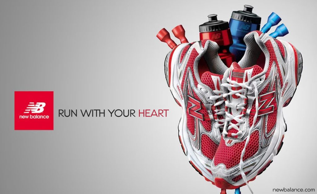
The way the a heart-like shape is created using the running shoes and the two sport bottles as the vena cava and the aorta is incredibly clever. It not only showcases the functionality of the shoes but also conveys the message of taking care of your heart through exercise.
Keeping the rest of the ad elements simple is a smart choice. Because by leaving the title clean and using a grey to white gradient background, the focus remains on the main purpose of the ad, which is promoting a their shoes. Too many details could distract from the message it’s attempting to give out.
This concept has a lot of potential with people who value their health and fitness. The use of a visually appealing design, a clear message, and a relatable target market makes it a strong advert.
Chicago Bulls Logo: Poor Design
For my bad example I’m going to use conceptual design to redesign the logo of the famous basketball team, the Chicago Bulls, by incorporating two sneakers into it. The Chicago Bulls logo is already well-designed and recognizable, but adding a use of conceptual design it can definitely make it even more interesting. The sneaker I have decided to incorporate into the logo is going to be the classic red, white and black Air Jordan 1 high top. The same shoe that became popular from the famous player Michael Jordan who played for the Chicago Bull team.
Now because the logo could use a couple ideas of conceptual design my first thought was too create the Bulls head by having the two shoes sole to sole, as that already creates some what of the shape that matches. But then add some other sections for the horns.
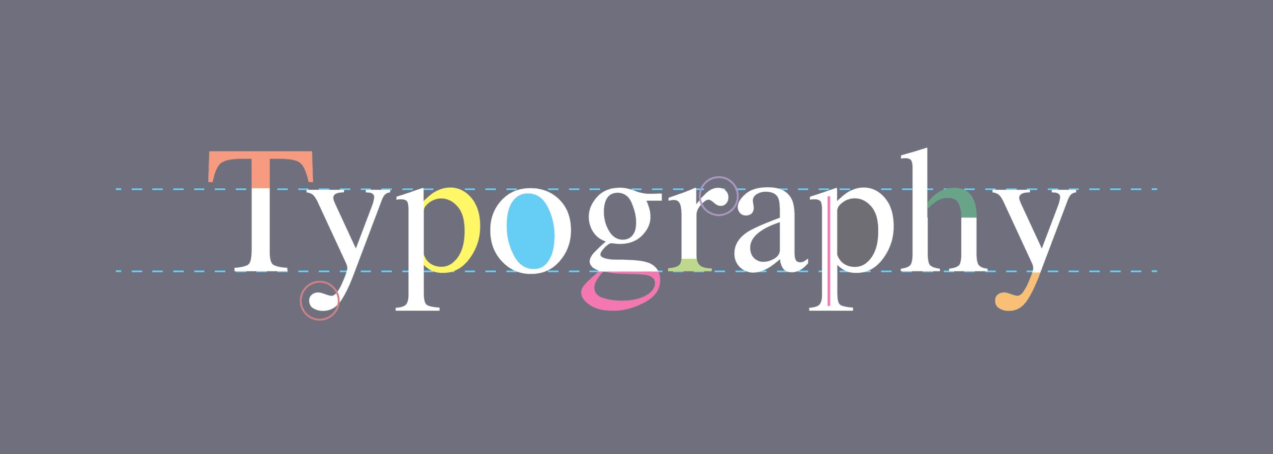
Another idea I can create is to incorporate the sneakers as part of the team’s name. I could play around with the typography and design to integrate the sneakers into the lettering. For example, certain letters can be remade with sneaker-inspired elements or use the laces to create interesting patterns within the text. This would create a visually appealing logo that represents both the team and the sneaker culture.
For my Re-design I deicide to go with the idea of making the logo out of the two Jordans. Making the logo out of the two sneakers definitely adds the extra level of visual interest. And because the logo uses a slab serif font, incorporating the name with laces clashed with the overall style. And it became hard to read. By using the sneakers to form the logo, I was able to maintain the style of the font while still showcasing the connection to basketball and sneaker culture.

0 Comments